Case study—Travous
Travous: Designing a brand identity for collective travel experiences
The art of group travel planning has long been a complex puzzle. It is fraught with logistical challenges that can transform an exciting adventure into a logistical nightmare. Travous is an innovative mobile application designed to revolutionise how groups approach travel planning, turning potential stress into collective excitement.
Our journey with Travous began in a deep discovery phase, when we sat down with its founder to understand the profound problem the app sought to solve. Group travel planning is a multifaceted challenge that goes far beyond simple scheduling. It involves orchestrating multiple calendars, aligning diverse schedules, managing intricate itineraries, negotiating activity preferences, tracking shared expenses, and maintaining crystal-clear communication among travellers.
Scope of work
Logo & identity system
Communications

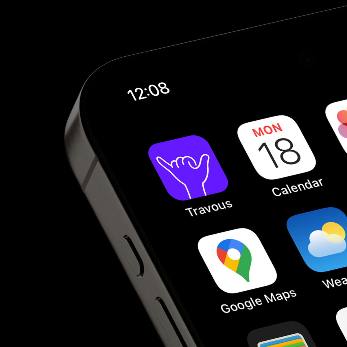
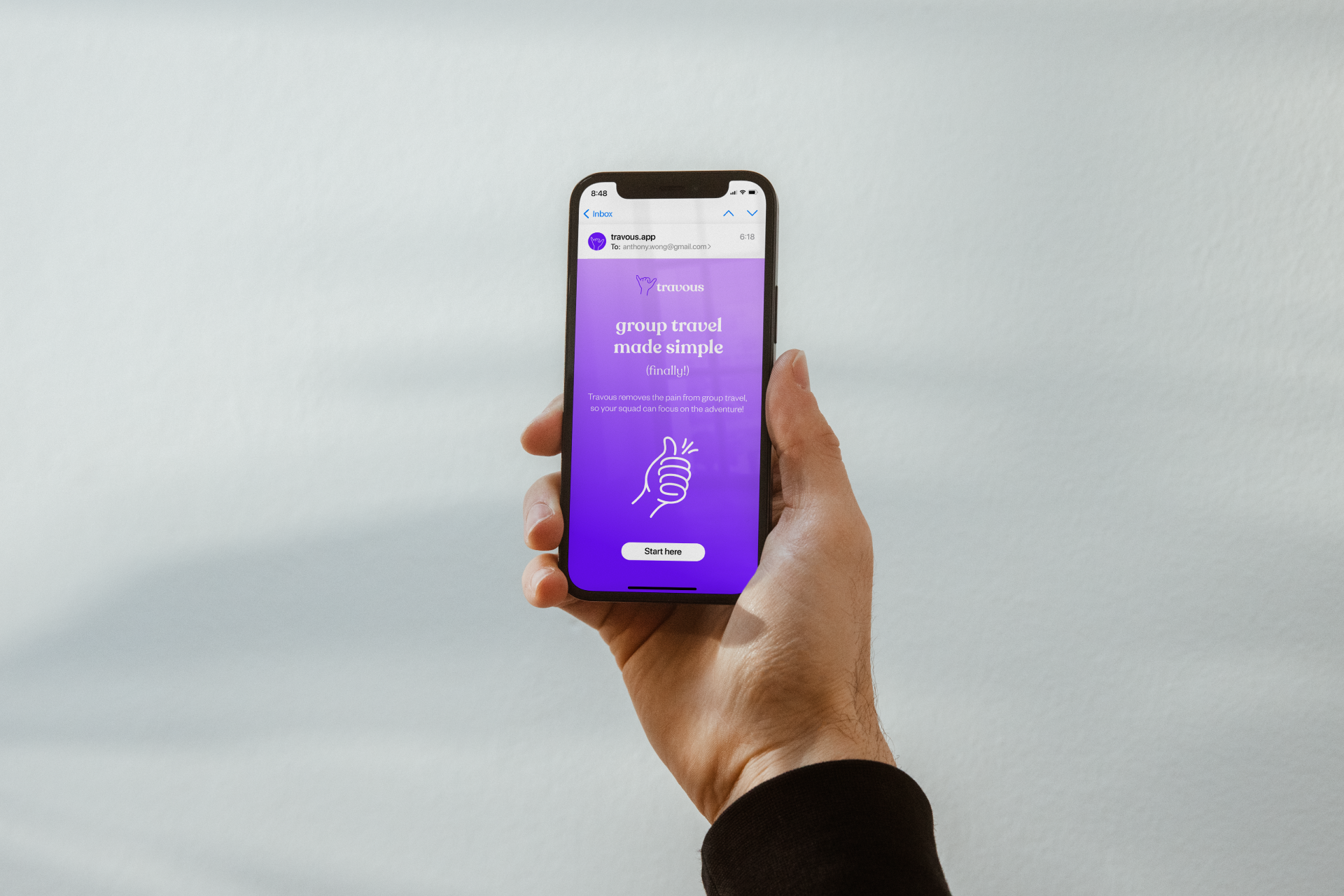
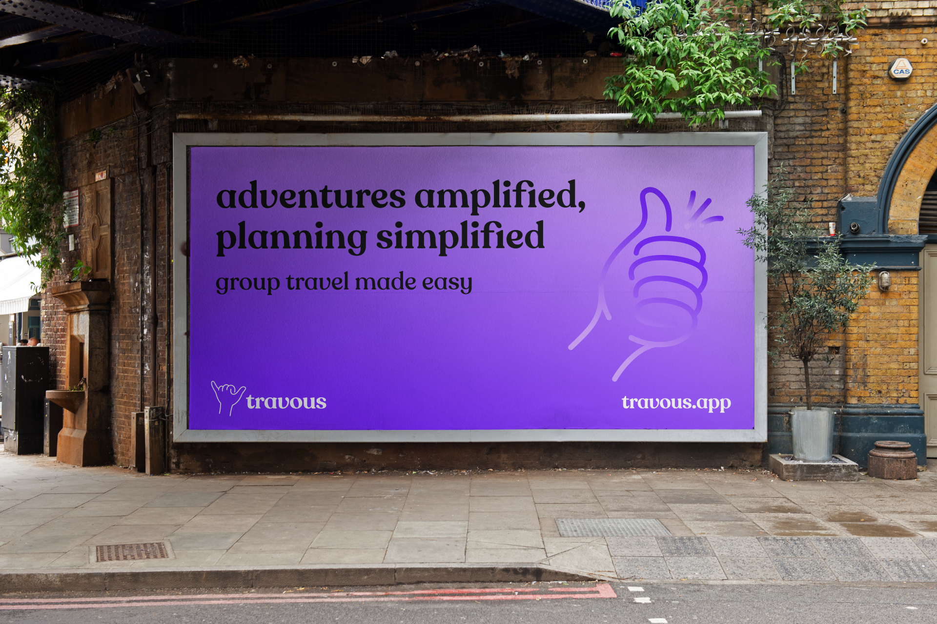
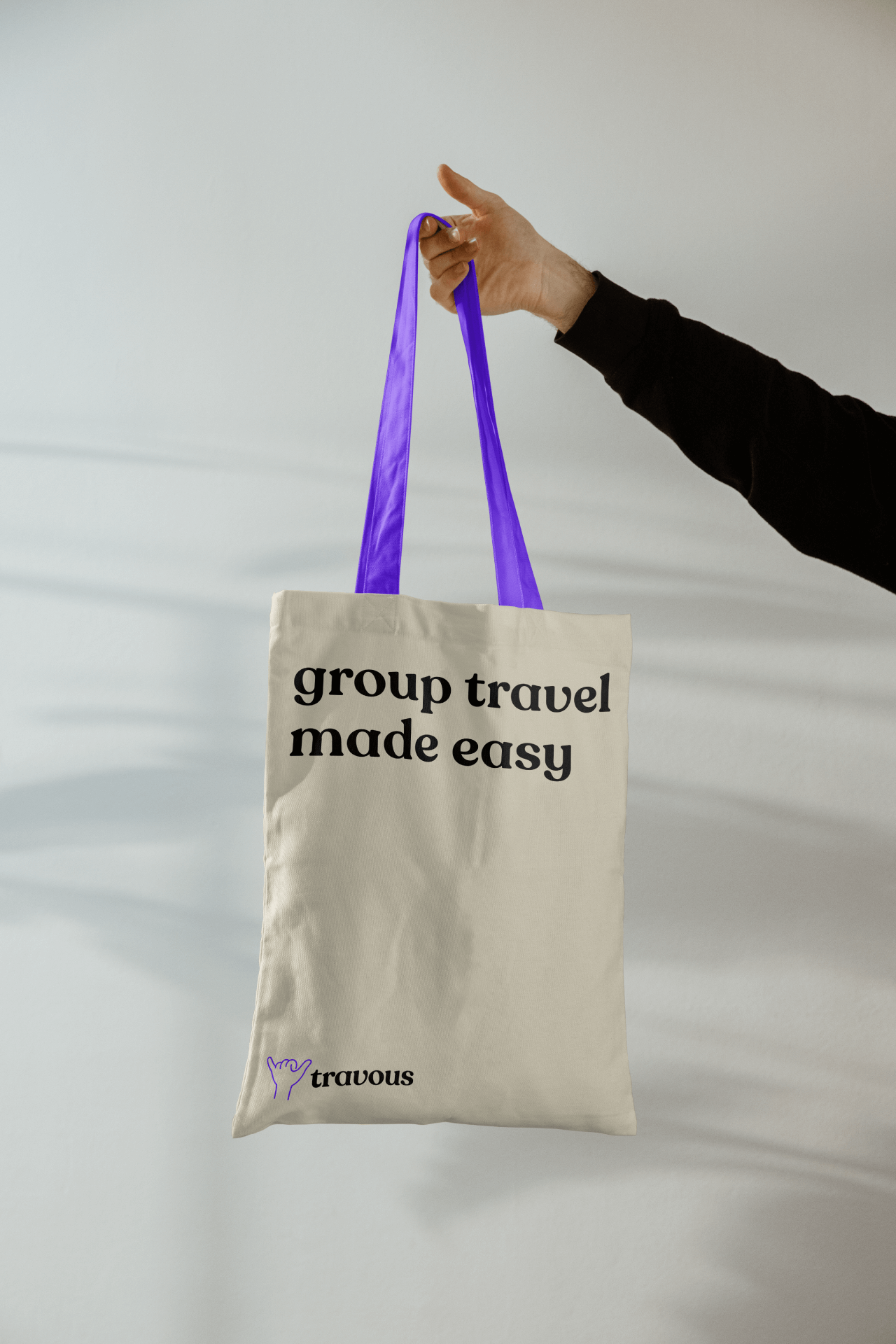
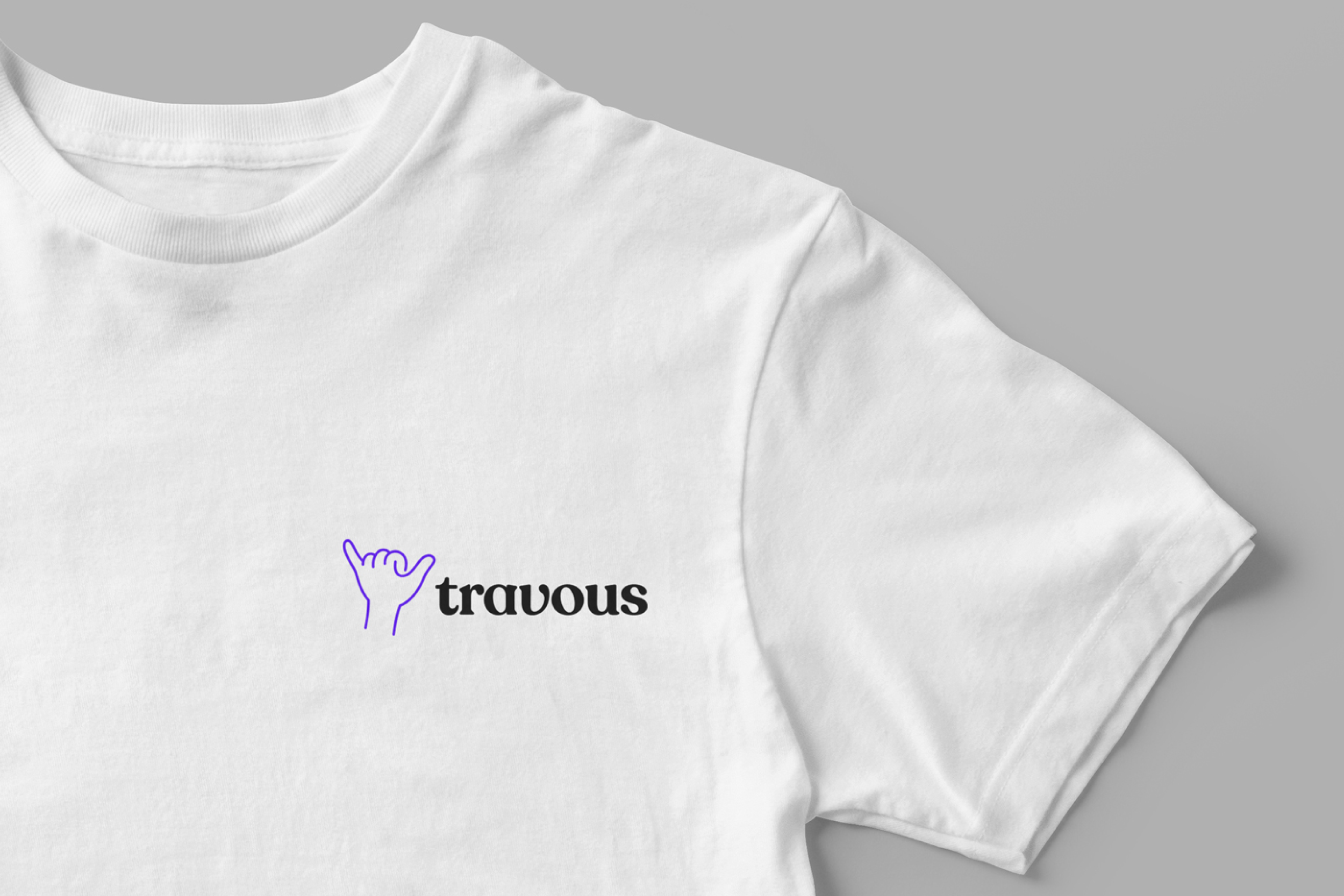
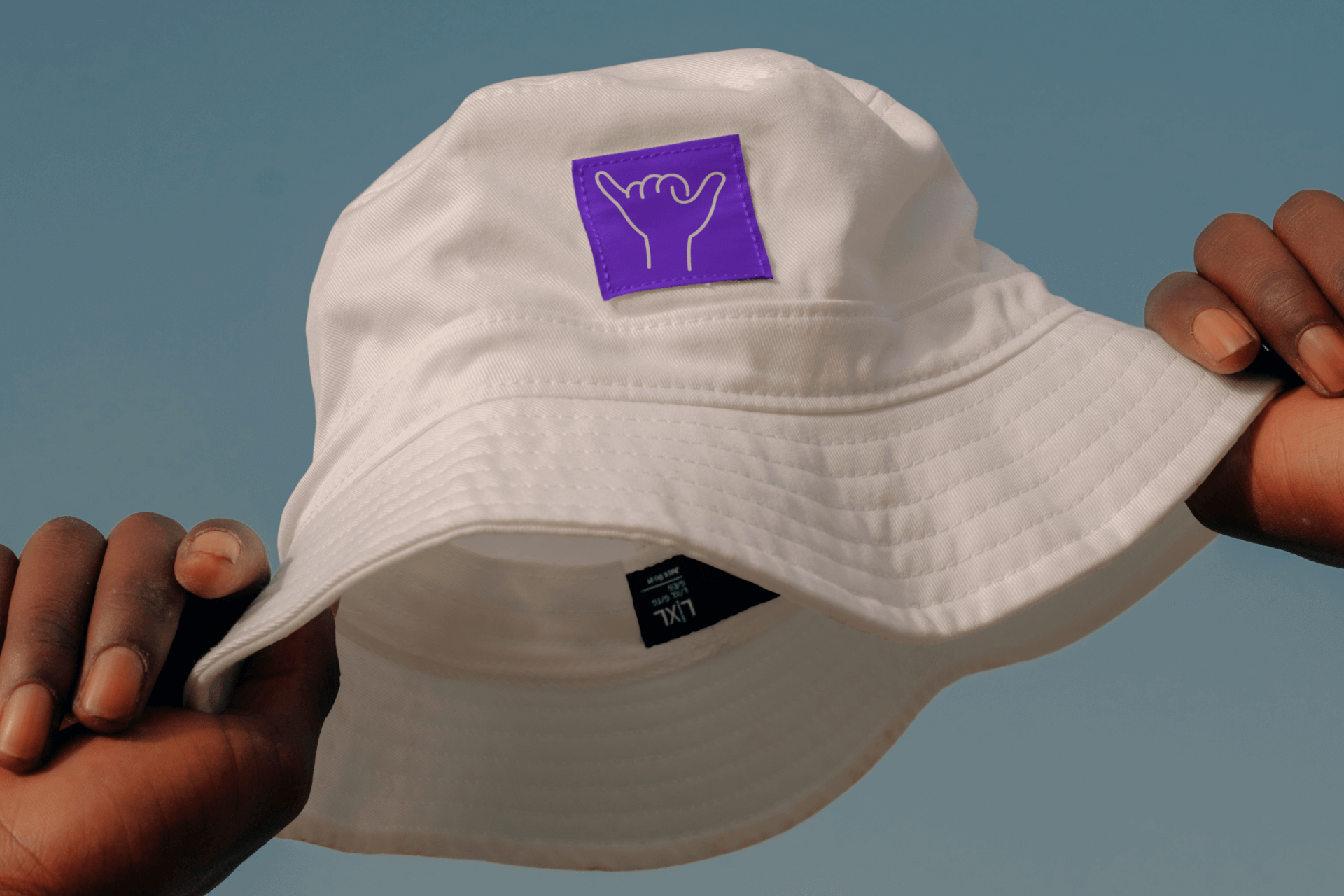
During our conceptual exploration, we discovered a symbol that would become the philosophical and visual heart of the Travous brand: the shaka hand sign. Far more than a simple gesture, the shaka originates from Hawaiian culture and carries a rich tapestry of meaning. It represents friendship, community, mutual respect, and a laid-back approach to shared experiences. This symbol became our beacon, illuminating the core values of the Travous brand.
The shaka allowed us to articulate a brand personality that was simultaneously playful and profound. It embodied an approach to travel that was collaborative and inclusive, adventurous yet easygoing, and fundamentally focused on human connection.
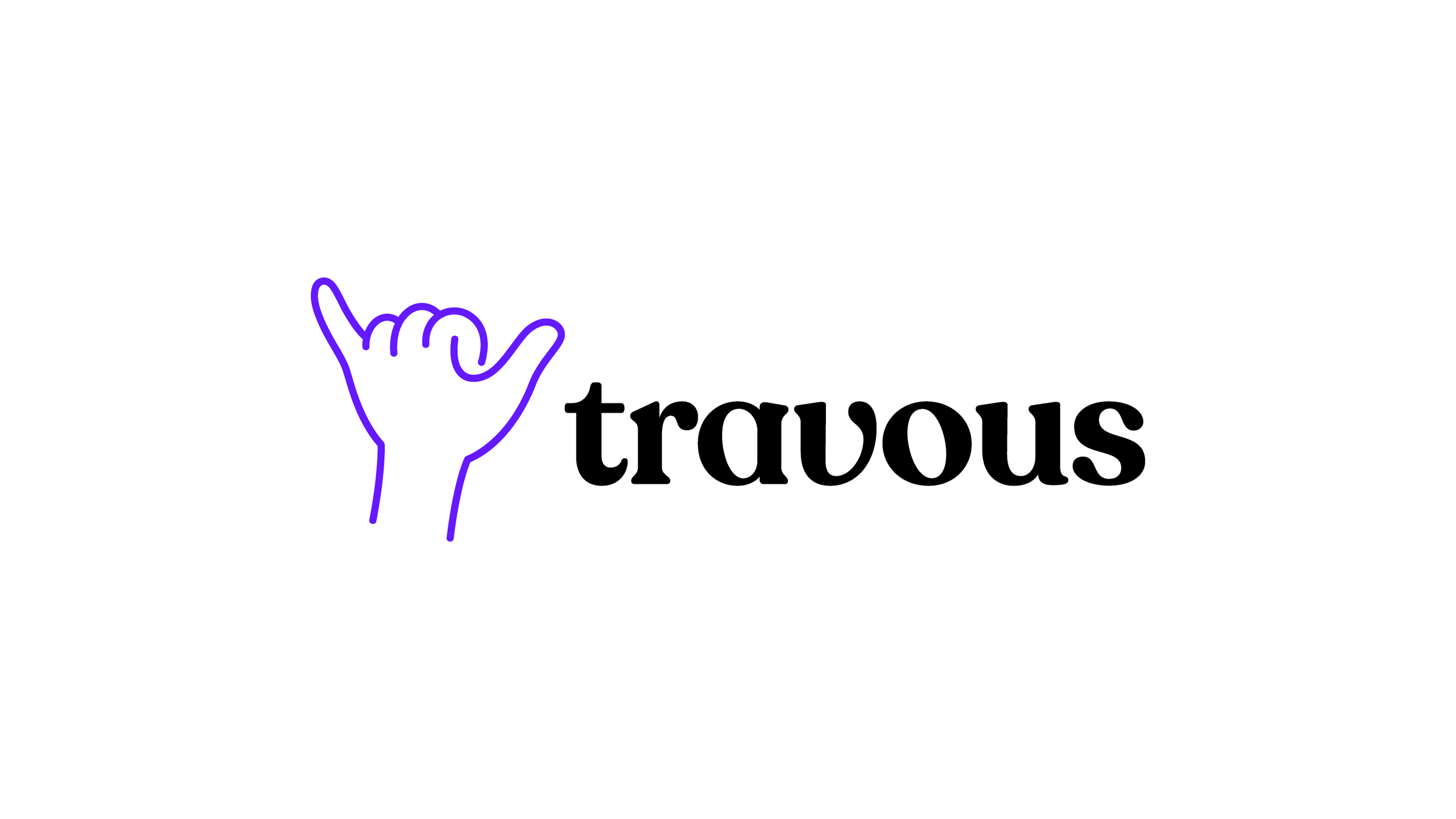
We paired the logomark with the expressive and individual Recoleta Alt type family, and specifically the Medium and Regular weights.