Case study—Moti Coffee
Branding the joyful coffee concept
The founders of Moti Coffee approached us with an exciting brief: to develop a brand identity that could break free from the often-serious world of coffee branding. Their vision was to create a cafe experience that felt welcoming, joyful, and unexpectedly fresh. Italian coffee culture was the foundational inspiration—a world known for its rich traditions, passionate approach to coffee-making, and inherent sense of community.
Our design strategy centred on creating a brand identity that would stand out in the crowded coffee marketplace. We wanted Moti to feel simultaneously sophisticated and approachable, drawing from the elegance of Italian coffee culture while introducing a sense of contemporary playfulness.
Scope of work
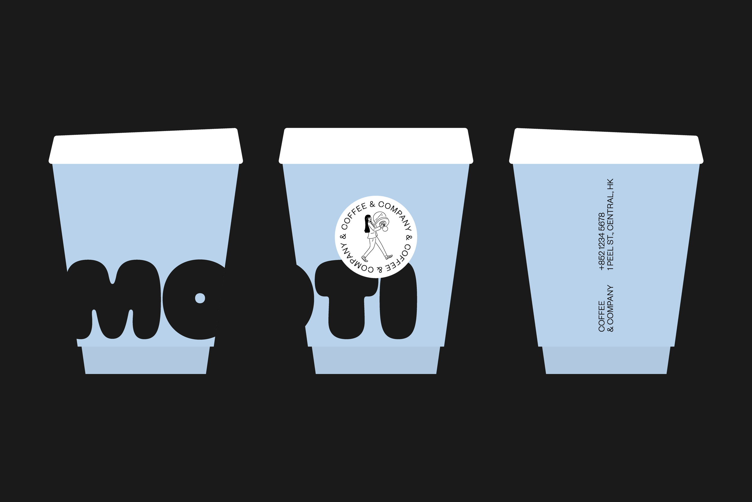
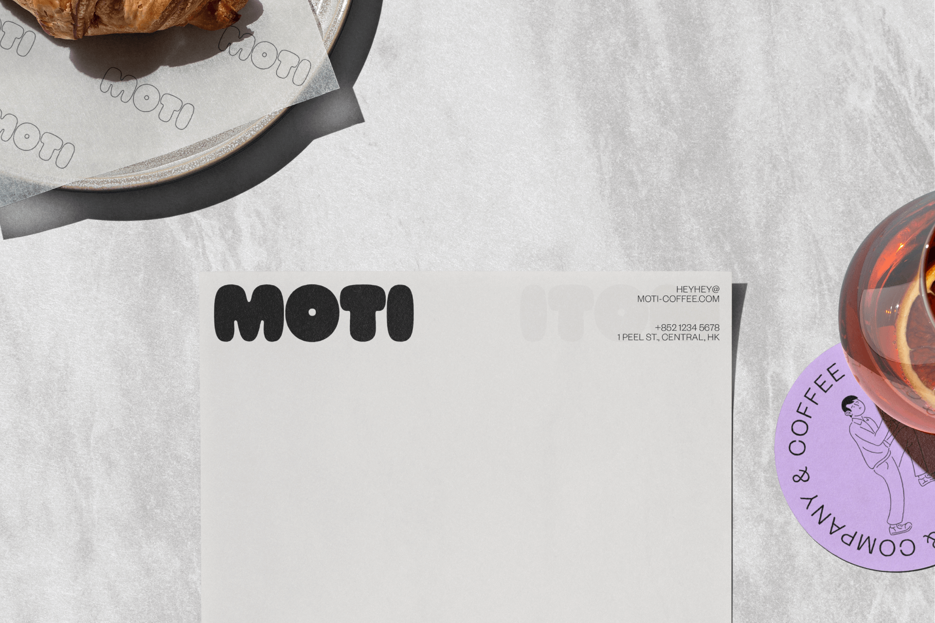
Logo & identity system
Communications
Content

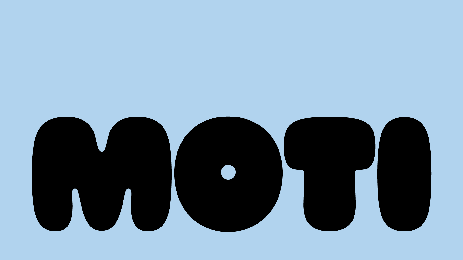
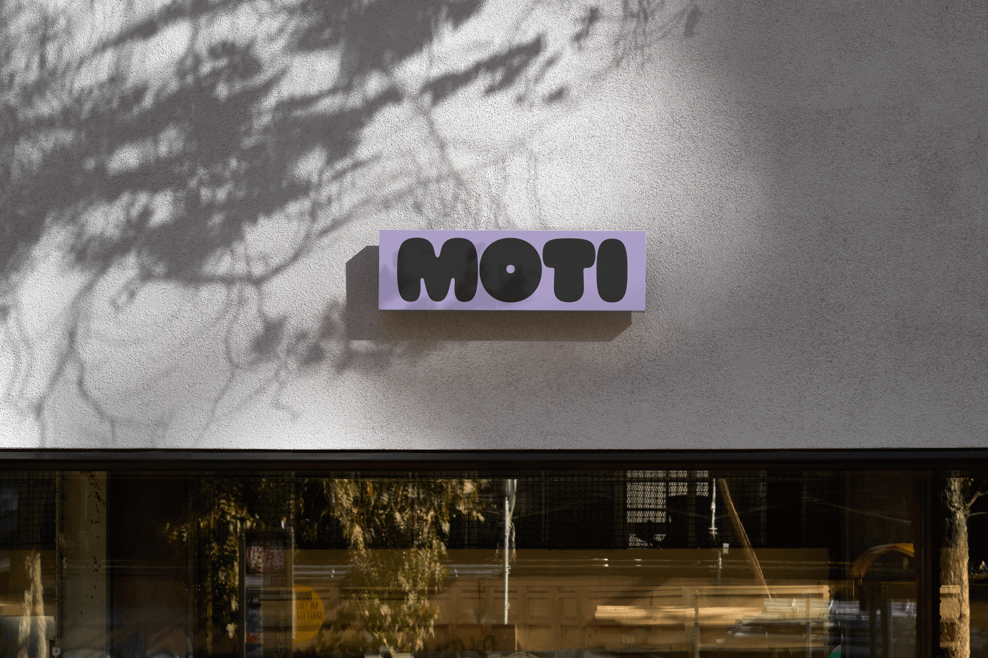
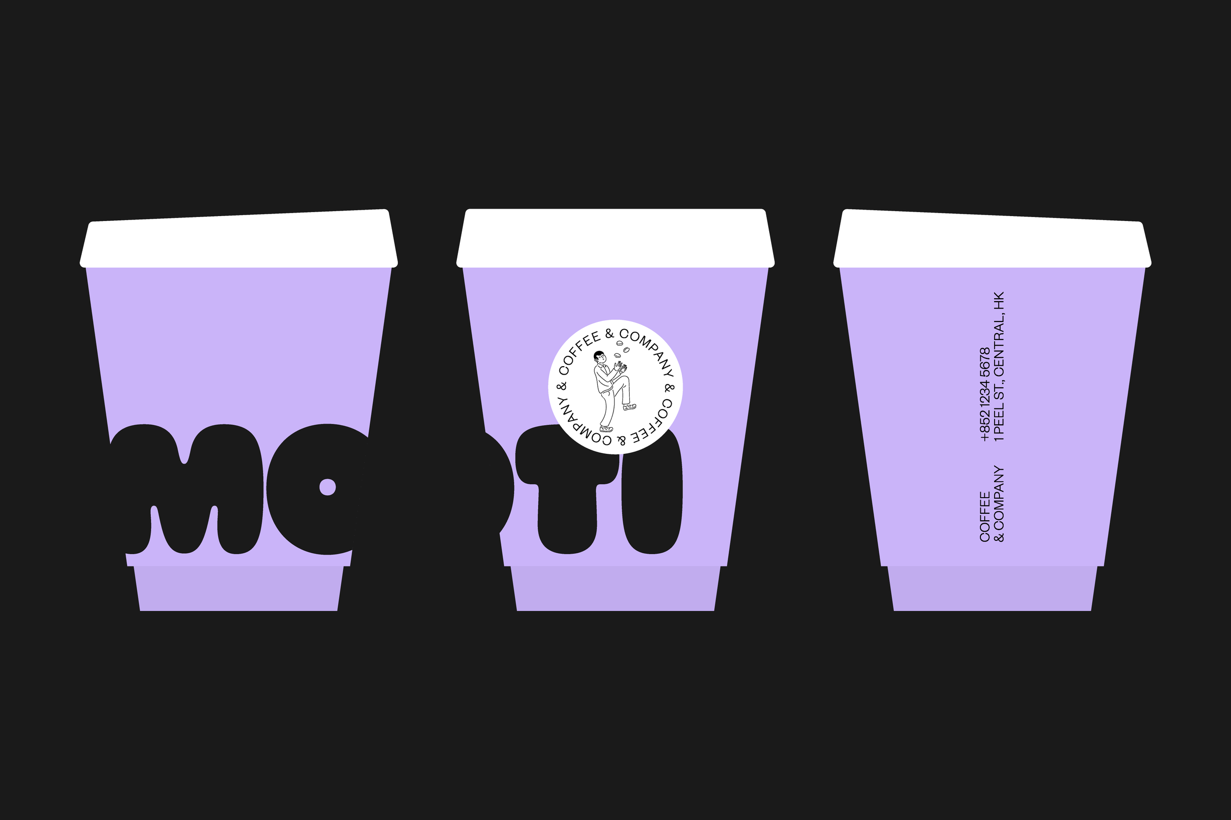
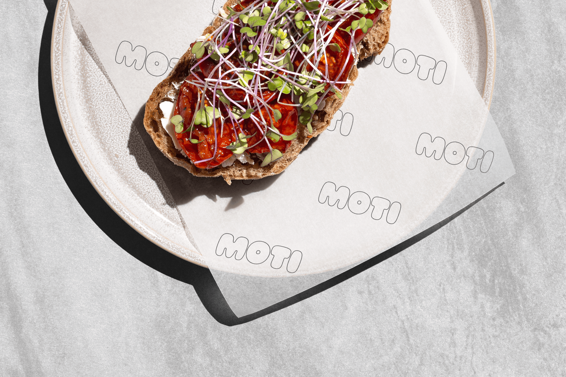
We created a bold, rounded wordmark that serves as the core of the brand's visual language. The rounded forms suggest warmth and approachability, while the bold stance communicates confidence and character. This wordmark became the anchor of Moti's visual identity, representing the brand's core personality.


The typographic selection became a critical component of the brand's communication. We paired the logomark with two distinctive typefaces that each bring a unique dimension to the brand:
Ohno Softie, with its playful and organic characteristics, introduces a sense of whimsy and informality. Its rounded forms and slightly imperfect edges echo the brand's playful spirit, creating moments of visual delight across various brand touchpoints.
Founders Grotesk, in contrast, provides a counterpoint of refinement and structure. Its clean lines and professional appearance balance the more playful elements, ensuring the brand maintains a sense of credibility and craftsmanship.


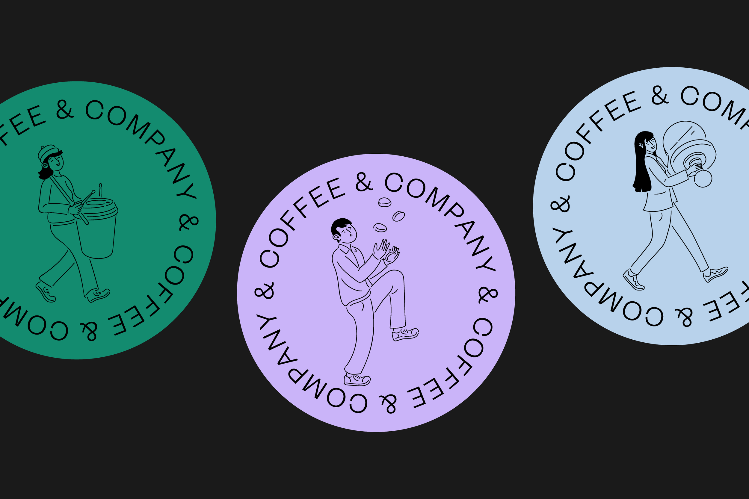


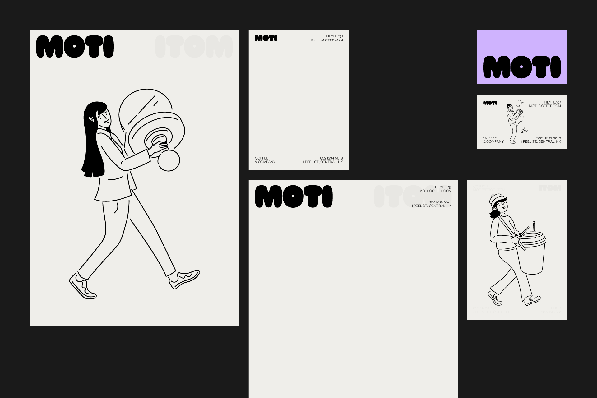


Thank you to illustrator, Dustin Holmes.
