Case study—Raw Lily
Branding Raw Lily: No toxins. No B.S. Just pure wellness.
Raw Lily is a pioneering e-commerce platform based in Hong Kong that curates the finest wellness products available. Recognising the nascent stage of the wellness market in Hong Kong, the founder sought our expertise to rebrand and position Raw Lily within this emerging landscape.
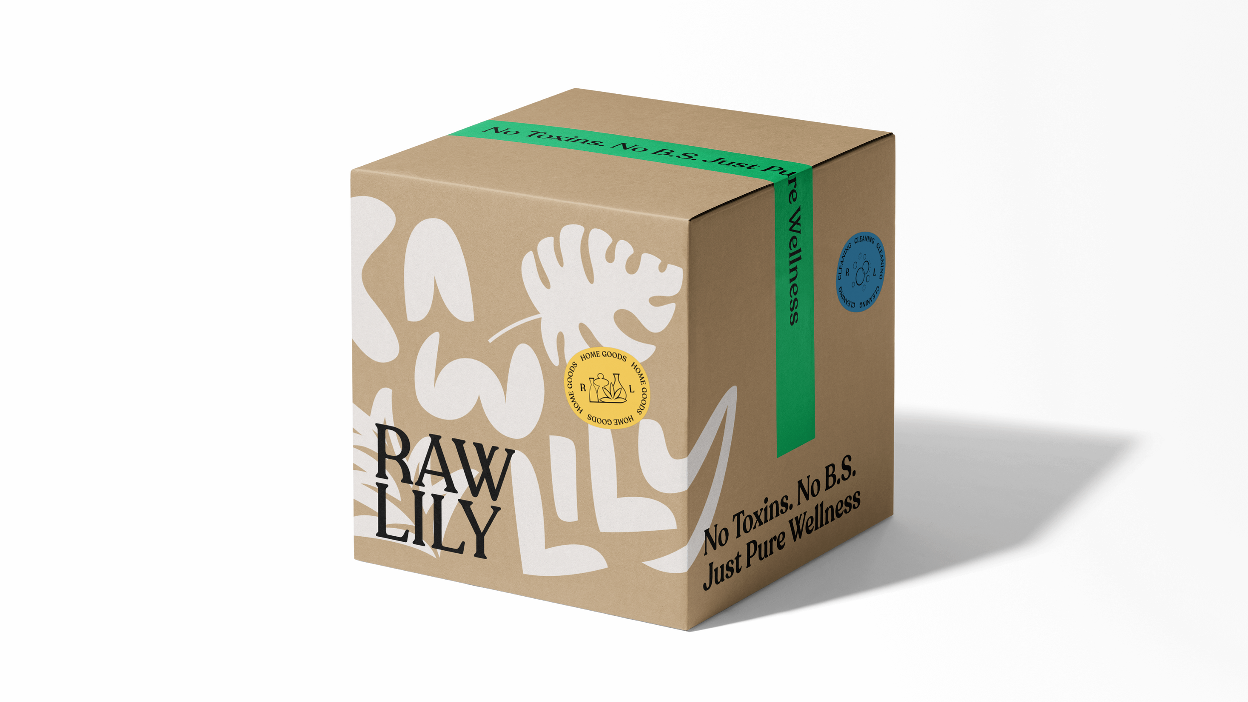
We strategically positioned Raw Lily as a rebel brand, challenging the status quo with an uncompromising commitment to sourcing only the highest quality products. This distinctive approach is reflected in the brand's authentic and no-nonsense tone of voice, fostering a genuine connection with discerning customers.
Guided by core values of ‘Customer well-being’, ‘Zero compromise’, and a shared commitment to ‘Thrive together’, Raw Lily's mission is redefining everyday wellness products' standards. Raw Lily empowers individuals to prioritise their well-being and cultivate a healthier lifestyle by championing exceptional quality and transparency.
Recoleta, chosen for its uniquely warm and playful character, serves as the brand font. This 'playful serif' typeface adds a touch of personality without being overly serious. Mabry Pro complements Recoleta, providing excellent readability for body copy.
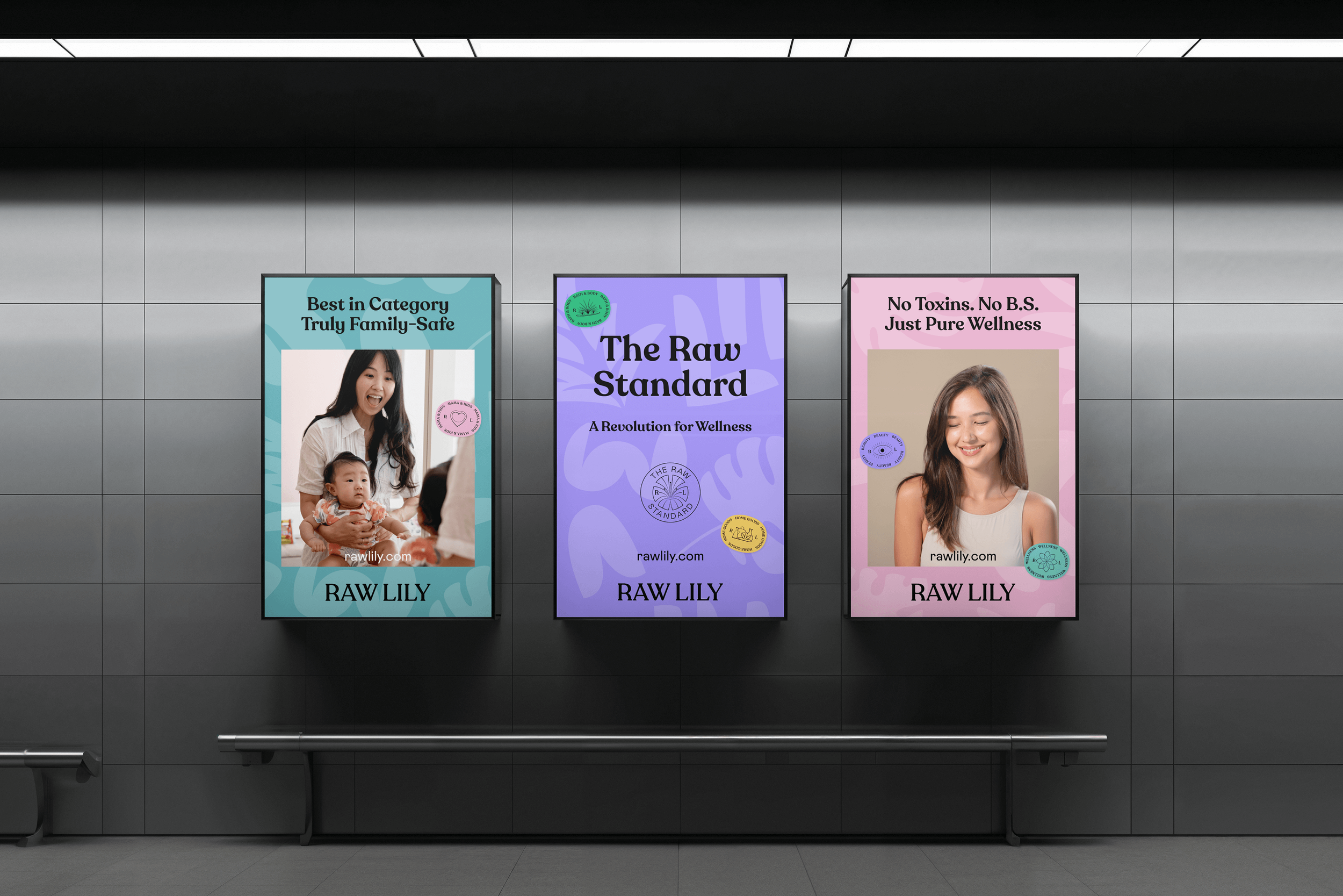
Raw Lily’s core purpose is to empower its audience by navigating the often confusing wellness landscape with buzzwords and fleeting trends. The brand voice strikes a unique balance between authoritative expertise and approachable guidance, resulting in empowering taglines that resonate with discerning customers.
To communicate its distinct approach to product selection, Raw Lily employs two unique curation methods, each represented by a distinctive lockup. These ‘stamps of trust’ reassure customers of the brand’s unwavering commitment to quality and integrity.
‘Conscious Curation’ signifies the brand's rigorous and discerning process in selecting products that align with its core values and meet the highest standards of quality and efficacy.
‘The Raw Standard’ transparently outlines Raw Lily’s growing ‘blacklist’ of harmful ingredients, providing customers with clear and concise information about the reasoning behind these exclusions and fostering trust through open and honest communication.


