Case study—Hack Chinese
Mandarin made simple: branding spaced repetition learning
In the complex language-learning world, Mandarin Chinese is among the most challenging languages for non-native speakers. Hack Chinese emerged as a revolutionary platform designed to transform this daunting learning journey into an accessible, engaging experience. When the founders approached us, their vision was clear: to refresh their visual identity and humanise the brand experience of learning Mandarin.
During the project’s first phase, we dove deep into the company and industry, speaking with the founders through our brand strategy workshops to tease out the key messages that would need to be communicated through their updated brand identity.
— Spaced repetition learning
— Personal development
— Communication
Scope of work
Brand strategy
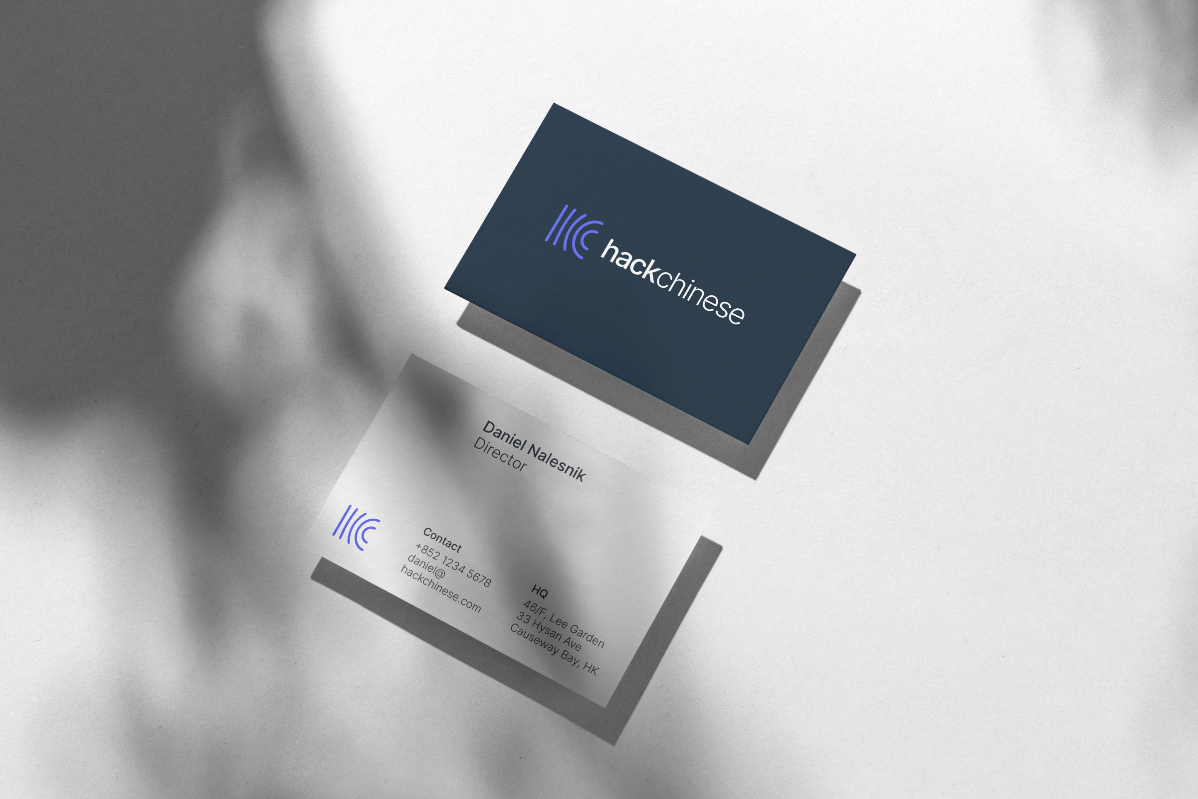
Logo & identity system
Communications
Our strategic approach began with an immersive exploration of Hack Chinese’s core identity. Through intensive brand strategy workshops, we peeled back the layers of the learning experience to uncover the fundamental messages that would define the brand:
Spaced repetition learning became more than a technical approach—it was a philosophy of knowledge acquisition. Personal development emerged as a core narrative, positioning language learning as a transformative journey of self-improvement. Communication stood at the heart of the brand's promise: language as a bridge between cultures, ideas, and human experiences.
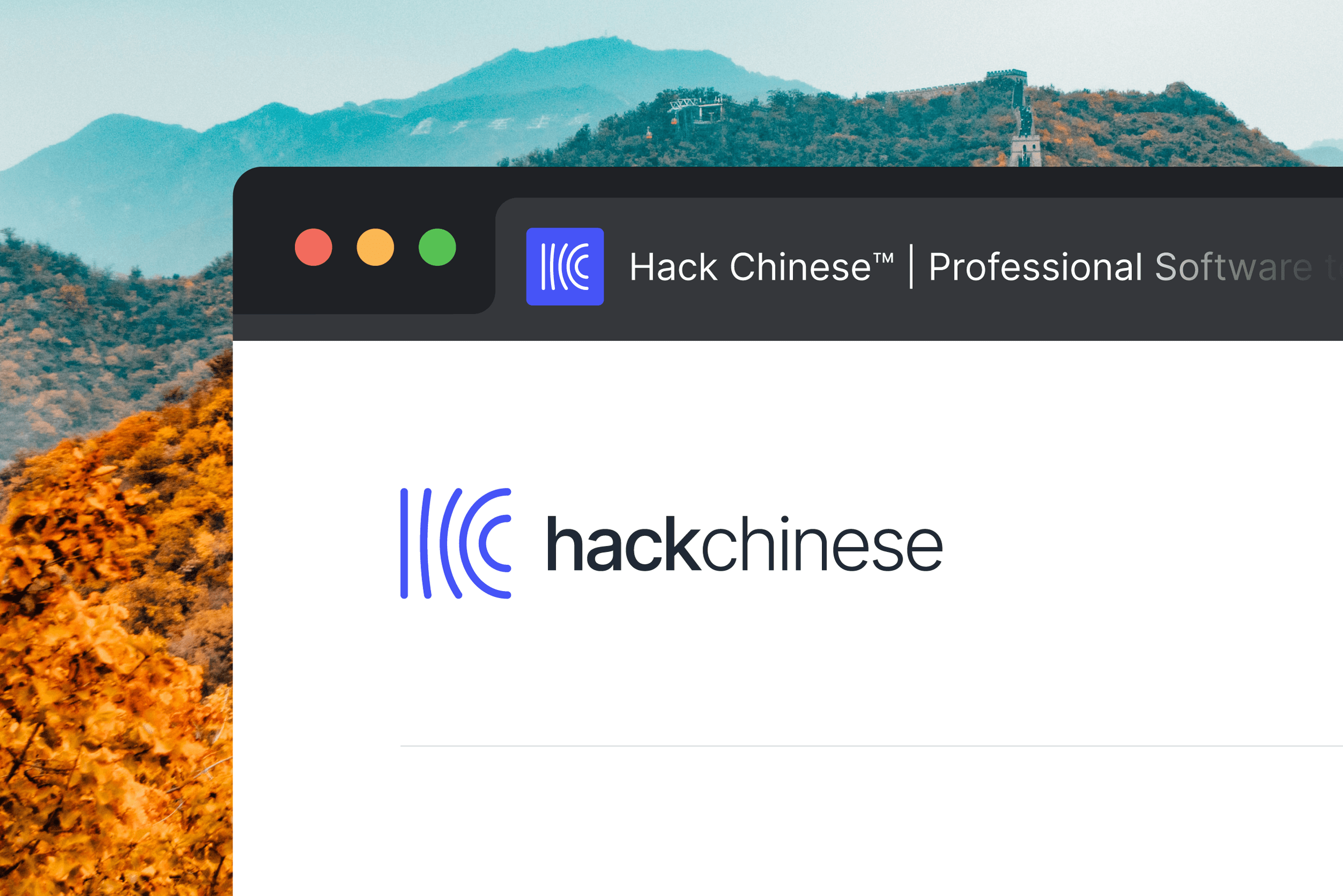
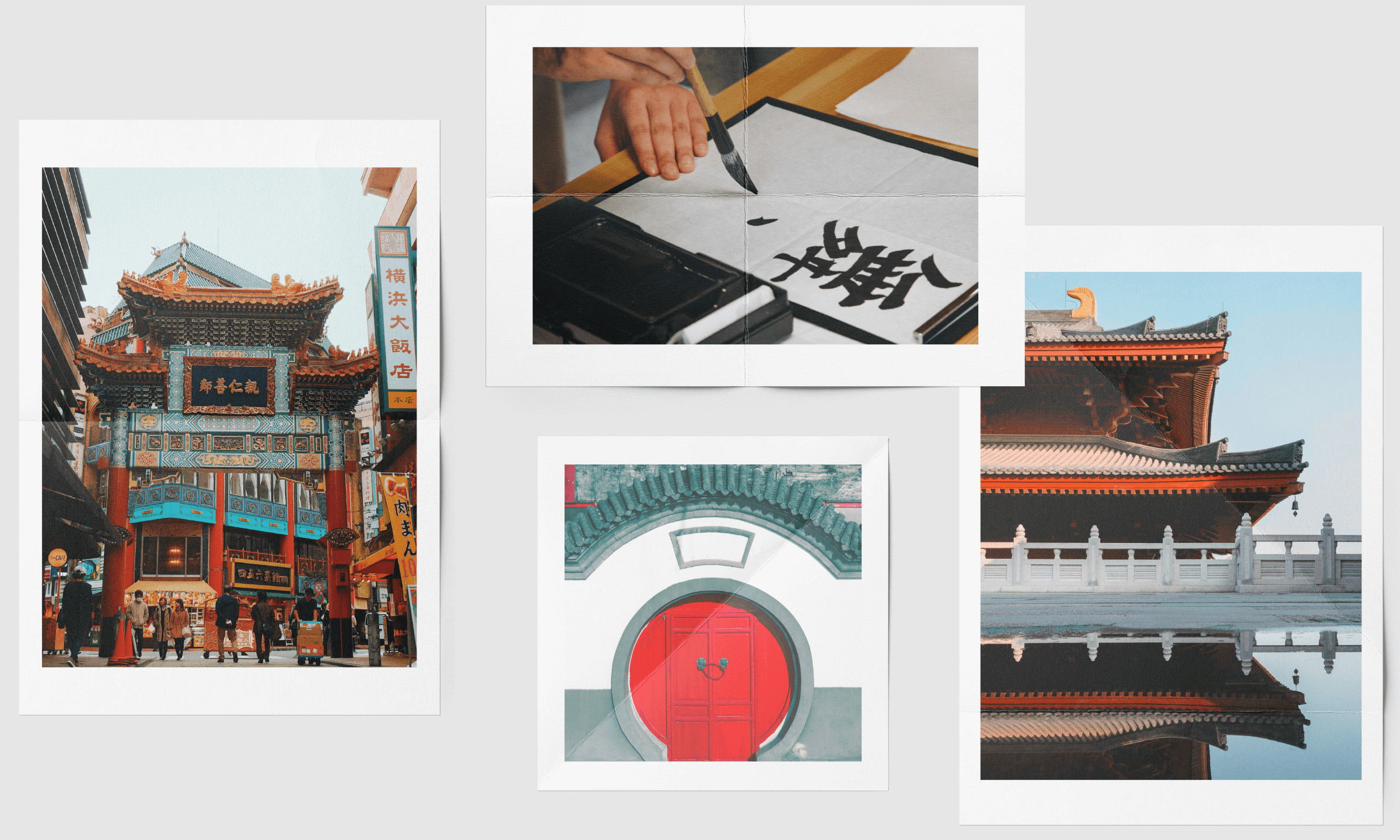
The logomark became a sophisticated visual metaphor that speaks to the art and science of language learning. Drawing inspiration from two rich cultural sources—the fluidity of traditional Chinese calligraphy and the geometric precision of Chinese architectural elements—we created a design that transcends mere visual representation.
Five lines move dynamically across the logo, telling a story of learning and memory. As the lines progress to the right, they gradually curve, symbolizing the way memories become stronger and more nuanced through spaced repetition learning. The logo simultaneously represents the company's initials and the journey of linguistic mastery.


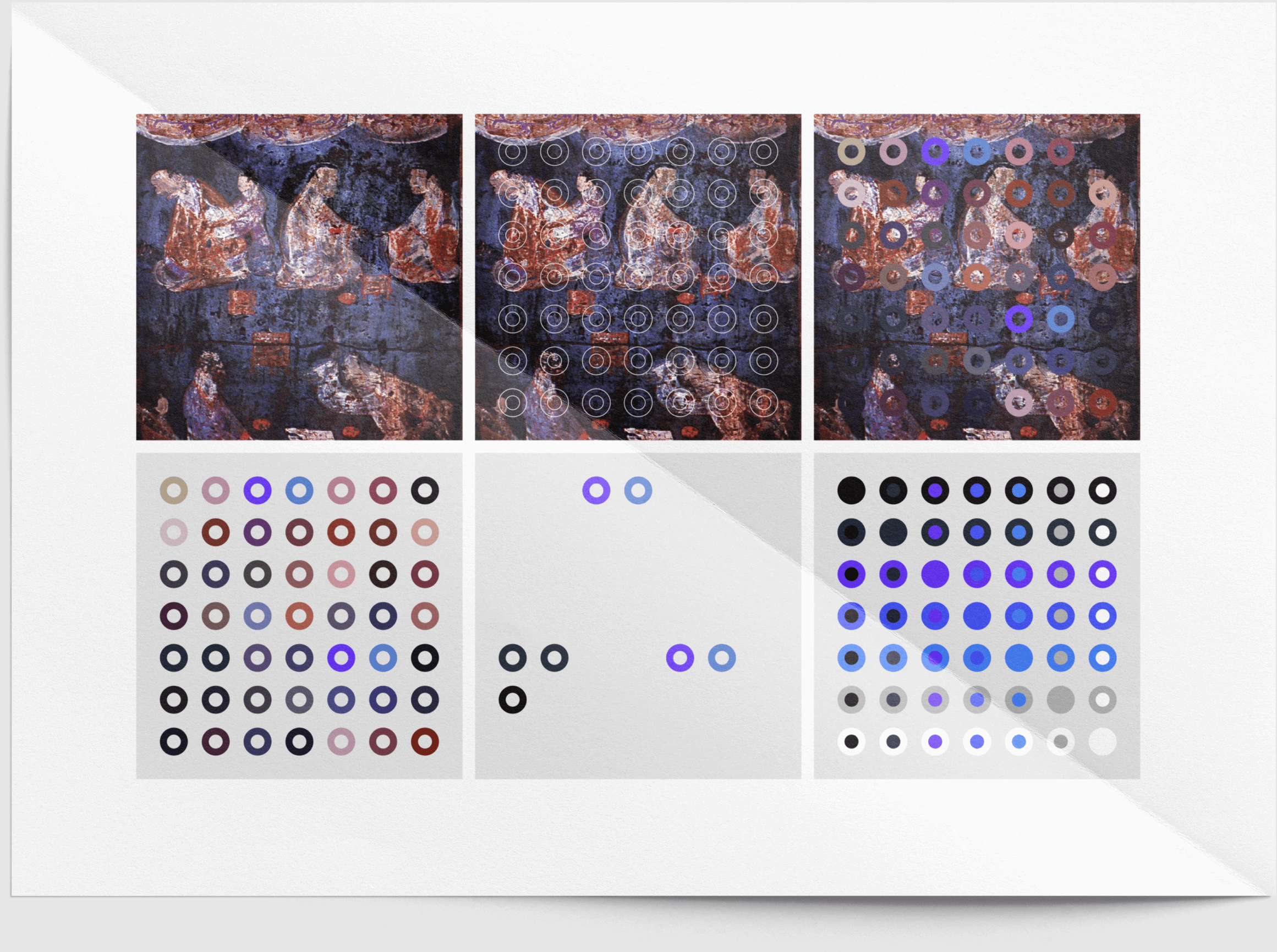
Our color palette drew from a profound historical source—Han Purple, an extraordinary synthetic pigment created during the Han Dynasty. More than a color choice, this was a narrative connection to Chinese cultural heritage.
Han Purple is a marvel of ancient technology, created using barium copper silicate pigments. Historically significant, this color adorned the legendary Terracotta Warriors and graced the garments of Han Dynasty royalty. By selecting this color, we created a bridge between ancient cultural sophistication and modern technological learning.