Case study—Studio Doozy
Designing a brand for inclusive innovation
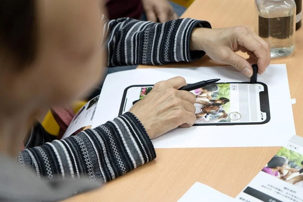
Studio Doozy is a unique force—a design studio committed to creating healthcare-focused consumer products with a profound sense of inclusivity. After five transformative years of growth and evolution, the founders recognised a critical moment of brand transformation. Their journey called for a visual identity reflecting their expanded vision and multifaceted business model.
Scope of work
Brand strategy
Logo & identity system
Communications
The studio's initial branding told a story of early-stage innovation—functional, but increasingly disconnected from the studio's expanding capabilities. What began as a focused product development venture had organically grown into a complex ecosystem with multiple business offerings. The existing visual identity struggled to communicate the studio’s depth and breadth.
The brand found itself at a crossroads, managing:
— An original product design studio
— A growing client-facing design consultancy
— An emerging e-commerce platform for healthcare products
Our brand strategy workshop helped reimagine the studio's entire brand architecture. Through intensive workshops with the directors, we explored multiple potential brand structures, carefully weighing the benefits and drawbacks of different approaches.
The strategic breakthrough came in defining a clear, purposeful brand hierarchy:
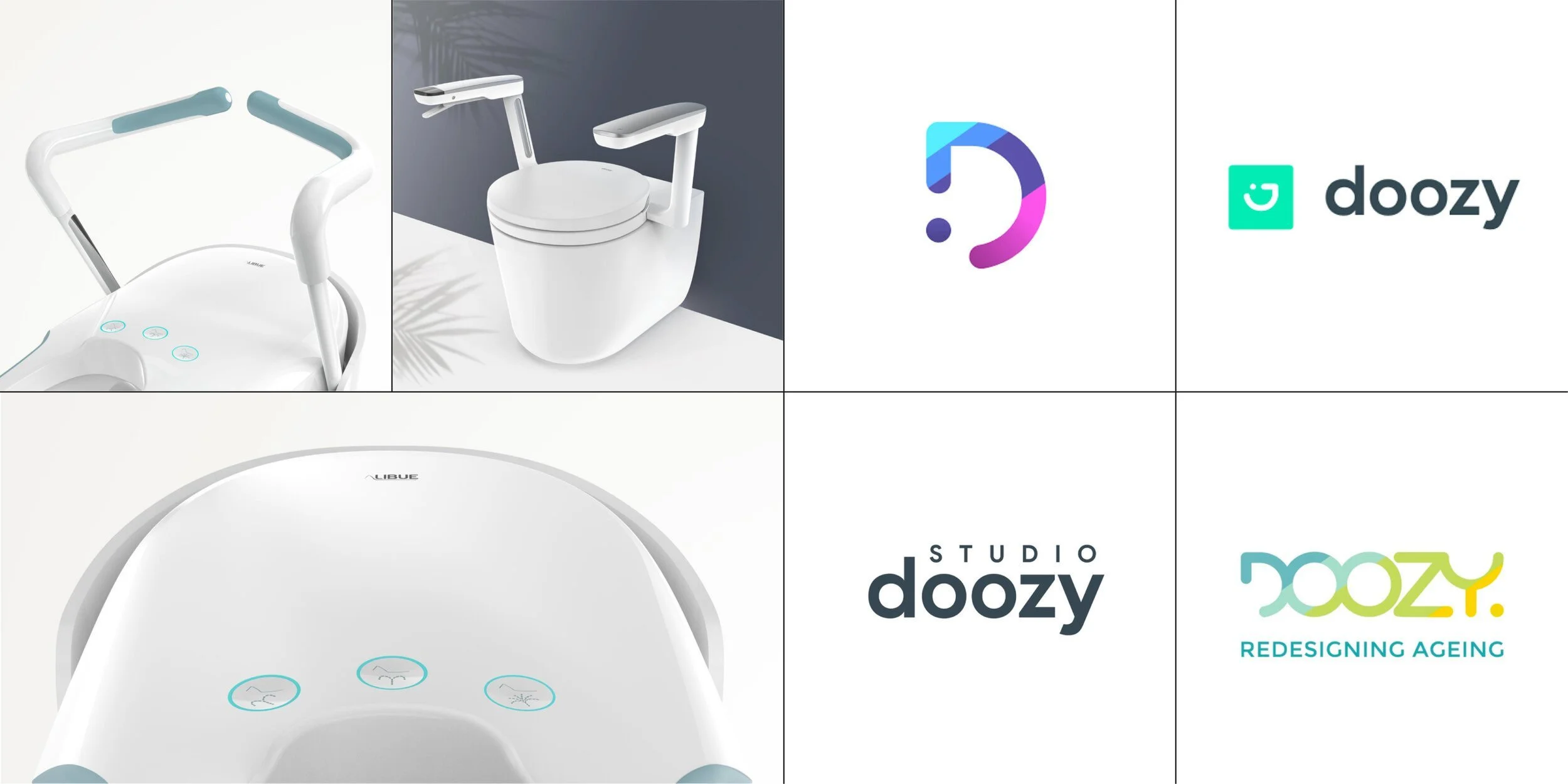
— Studio Doozy would serve as the group brand and primary design consultancy
— Doozy would become the brand for self-initiated product design
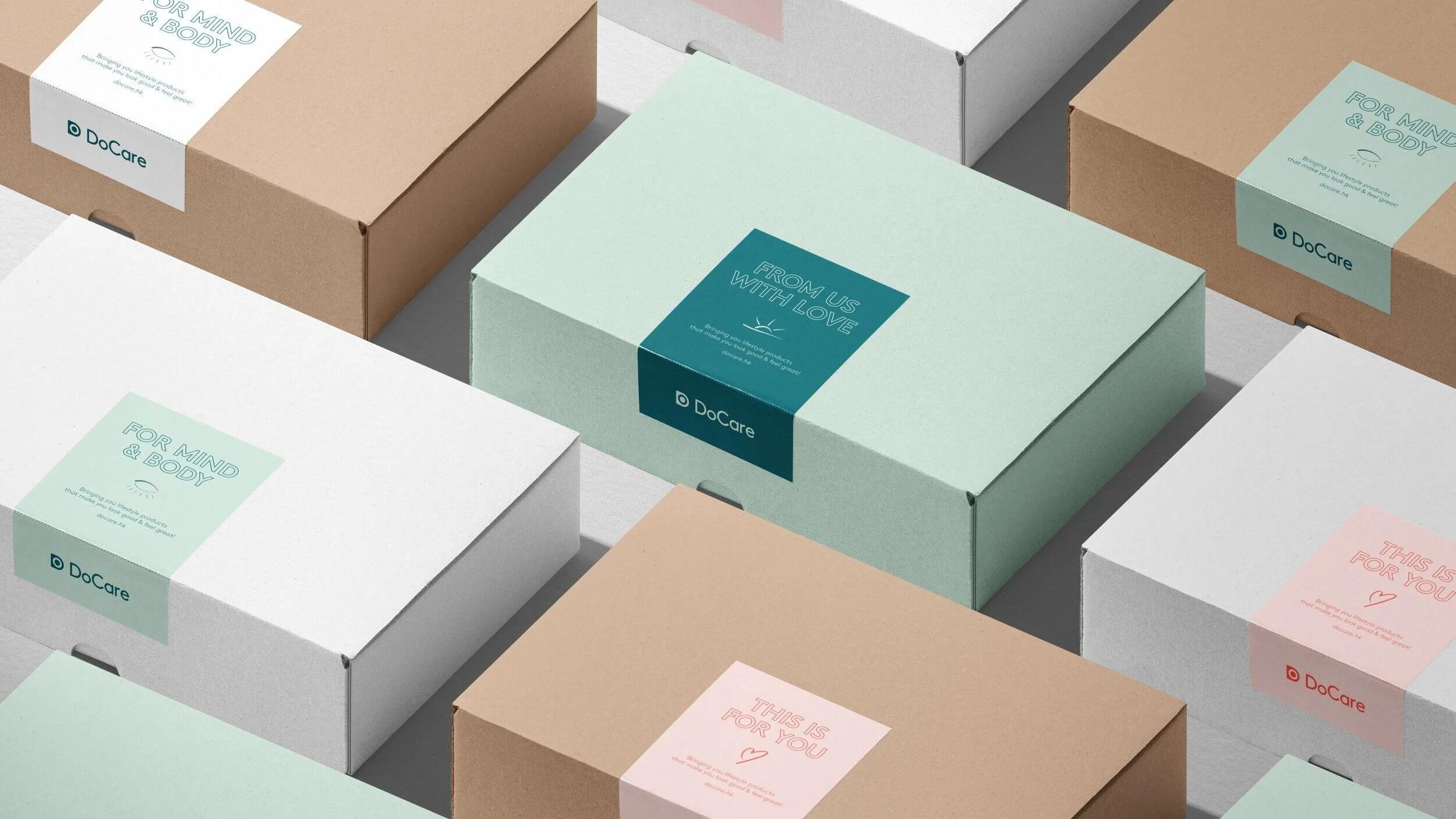
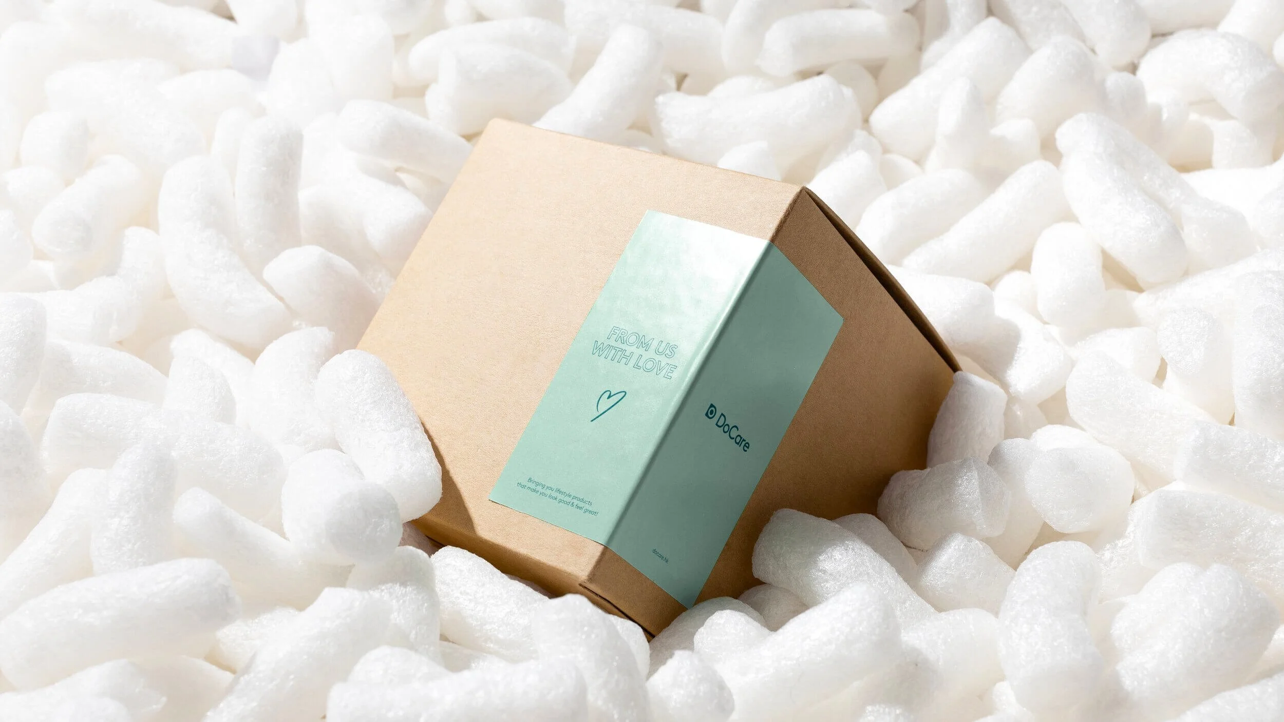
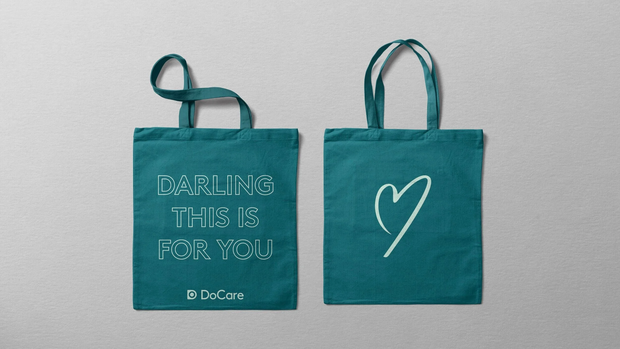
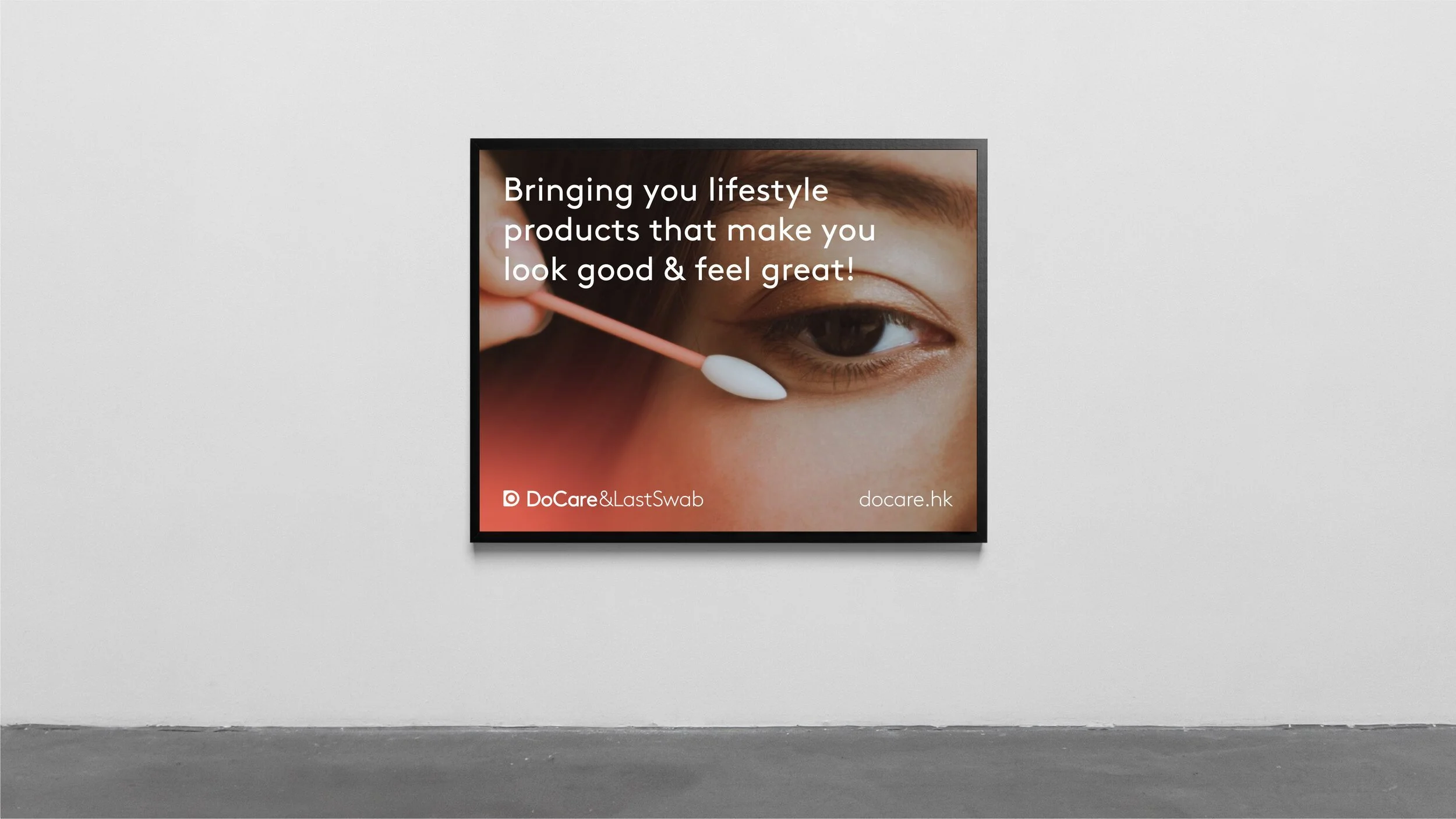
— DoCare would represent the lifestyle and e-commerce store
This approach allowed distinction and connection across the studio's various offerings.
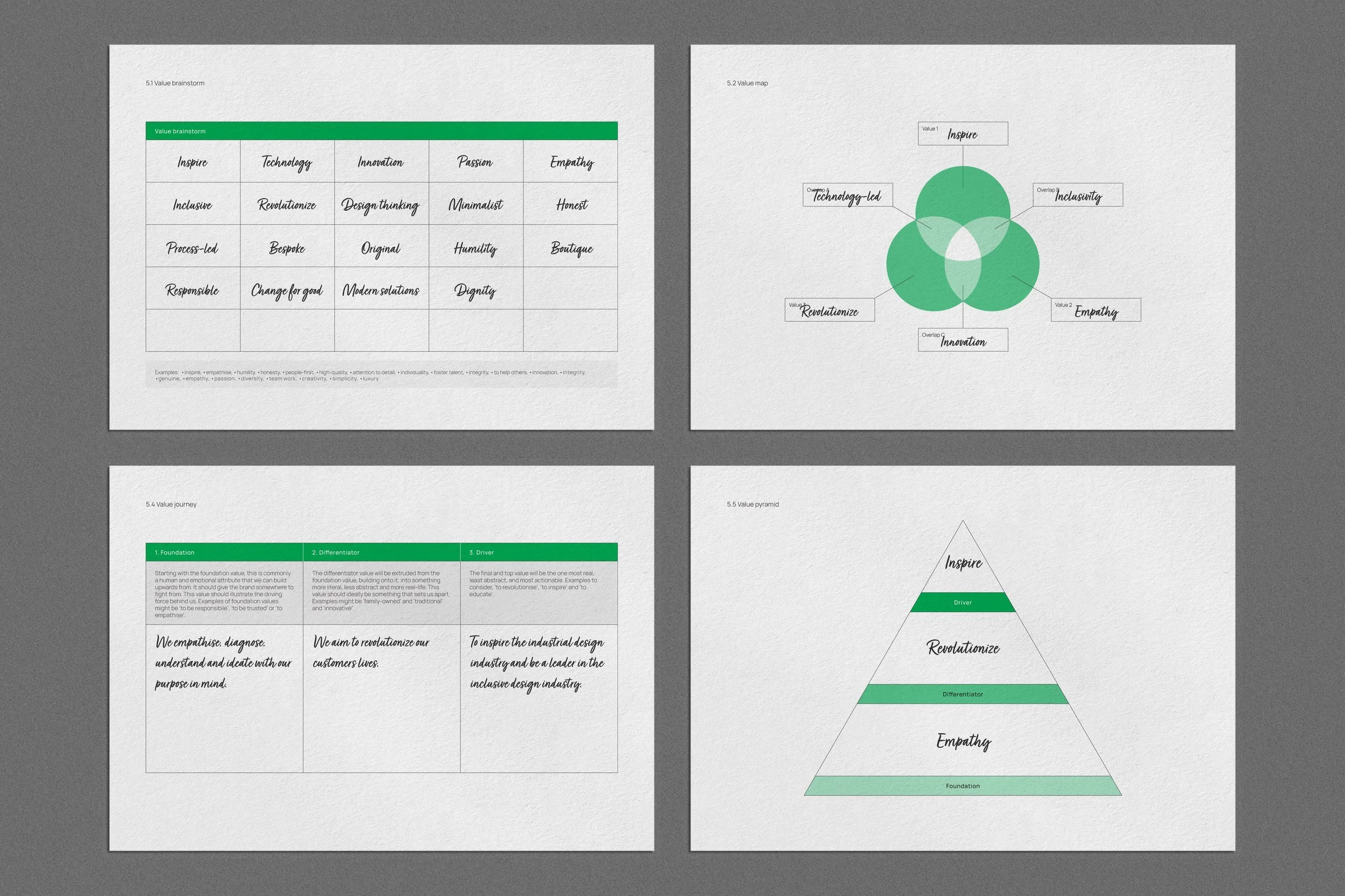
Three core values emerged as the philosophical foundation of the brand:
1. Inspire: Driving innovation through imaginative design
3. Revolutionise: Challenging conventional approaches to product development
3. Empathise: Placing human experience at the centre of design


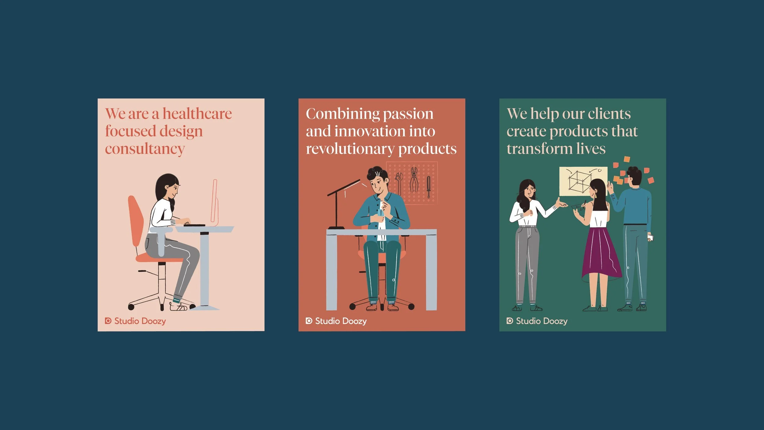
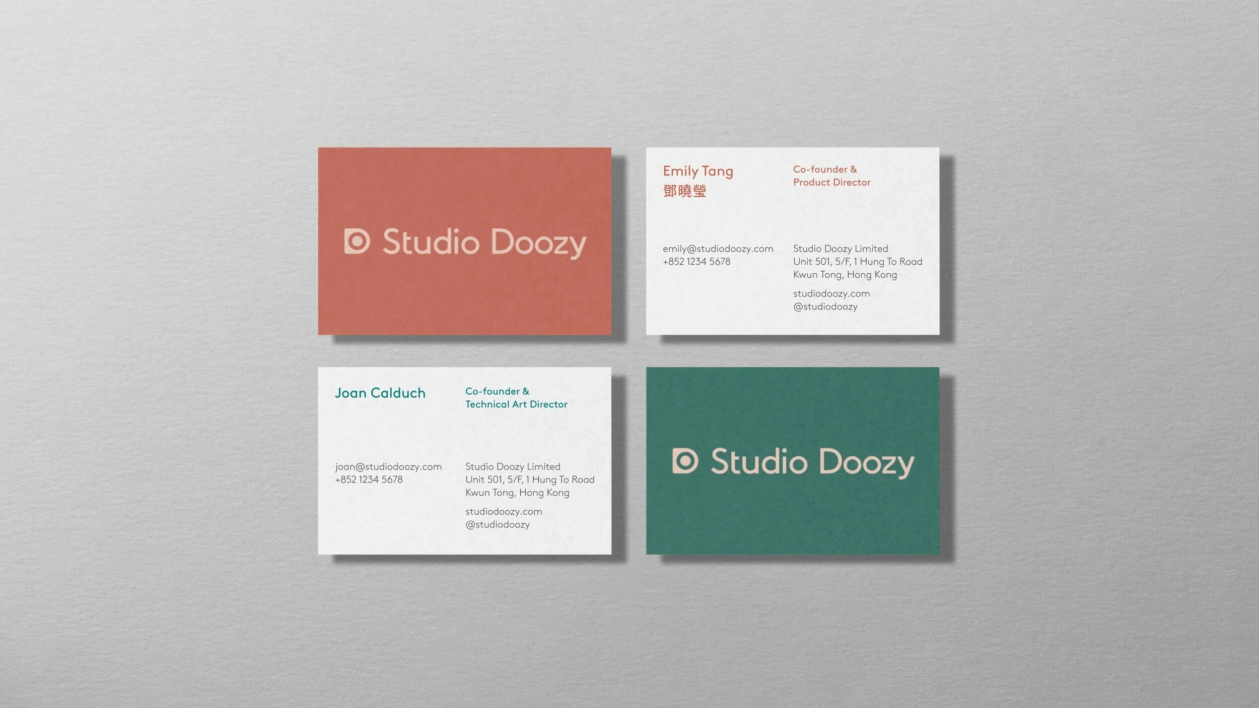
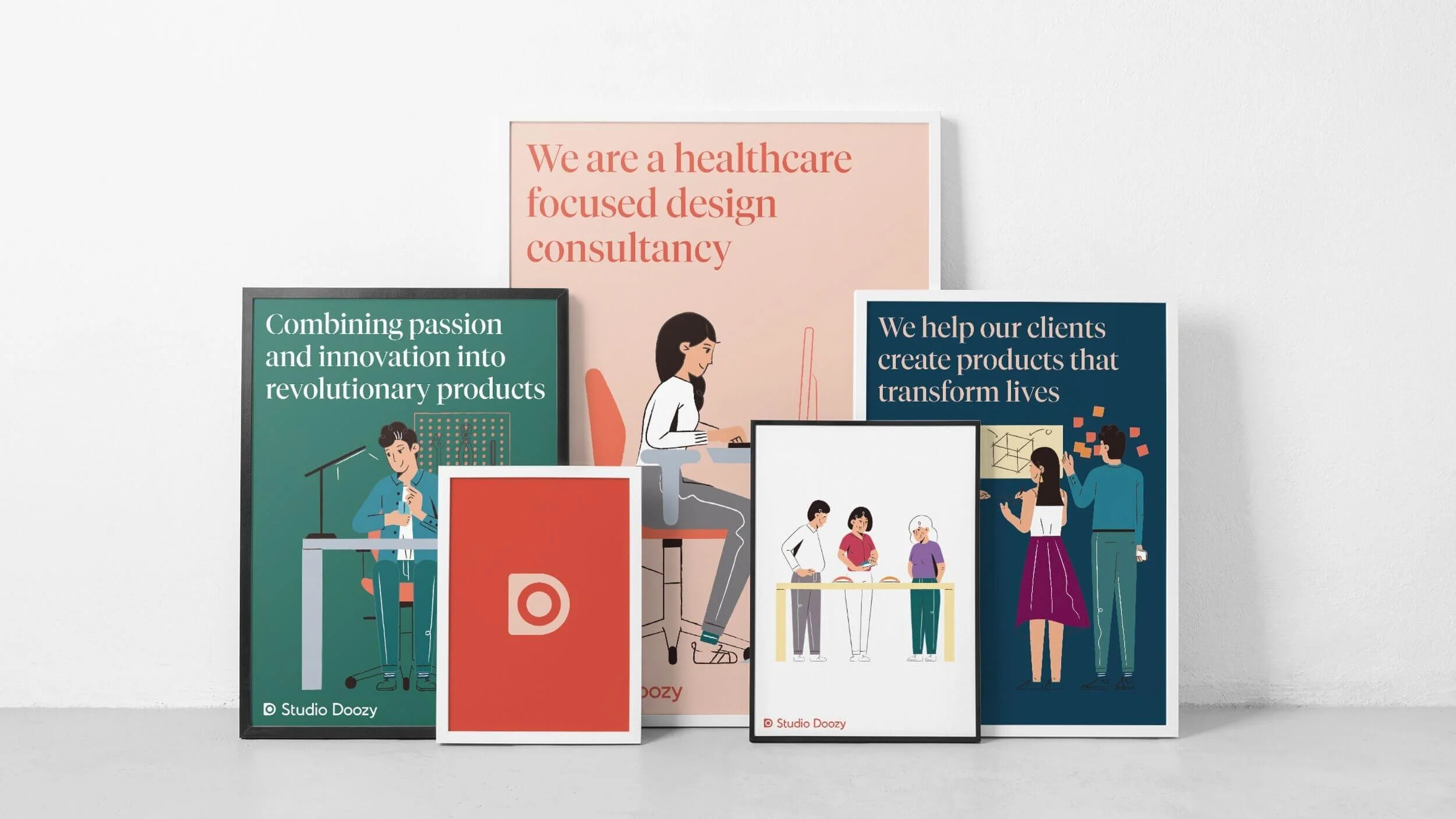
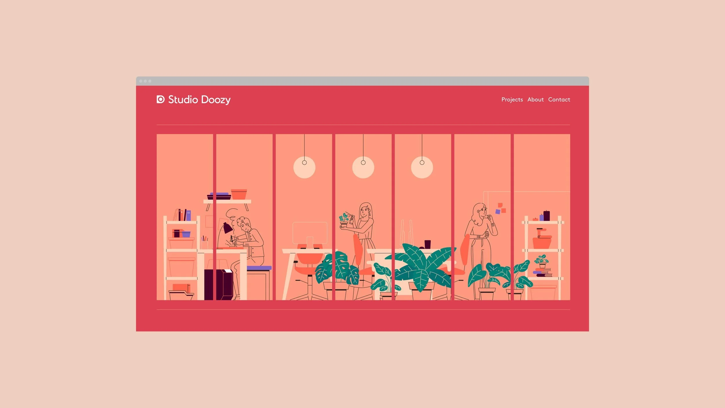
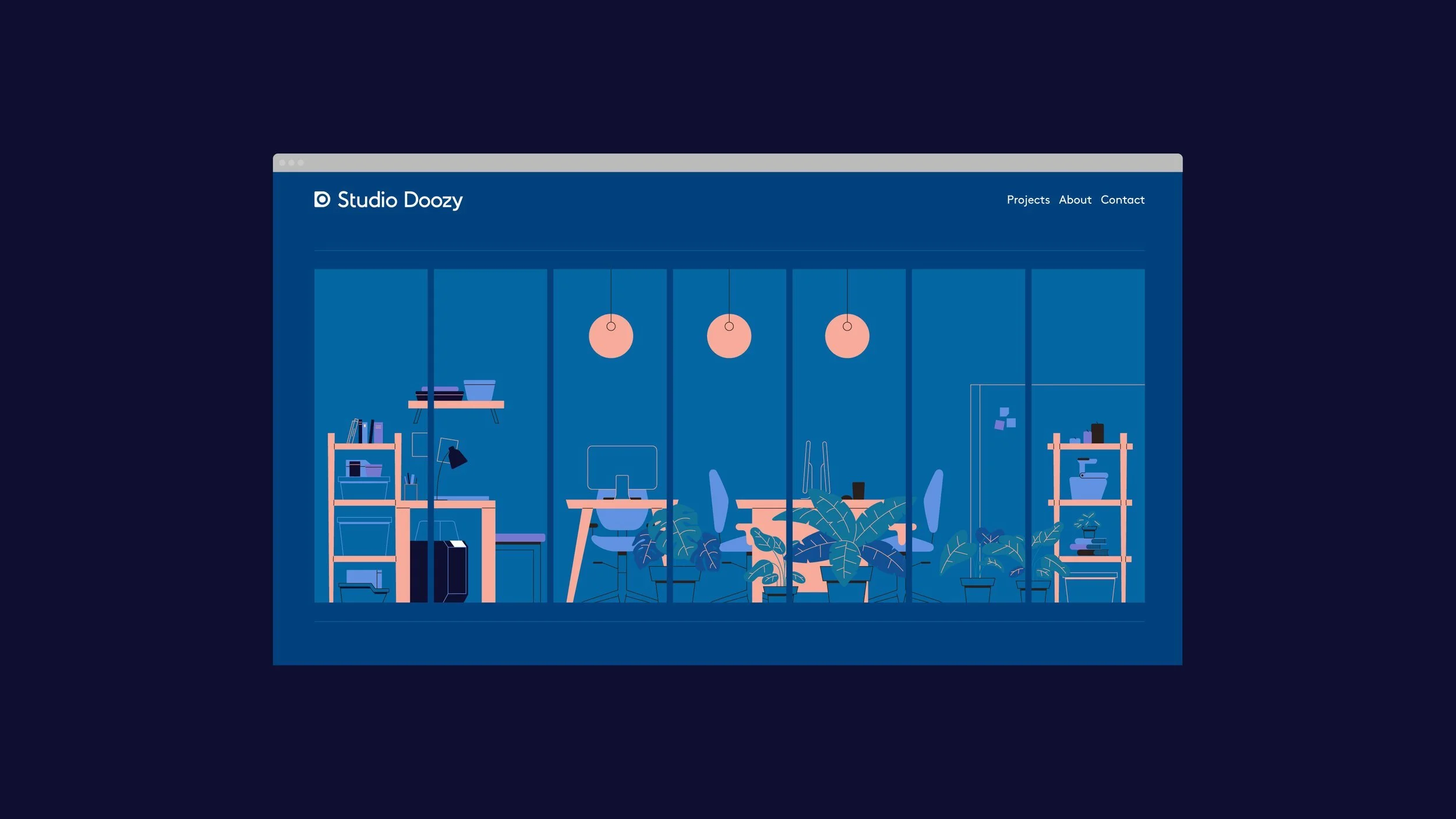
The resulting brand identity became a sophisticated visual narrative of Studio Doozy’s mission. Every design element was carefully considered to communicate the studio's unique approach to product design.
The logomark—a stylised ‘D’—became a powerful metaphorical element. Its circular centre is more than a geometric choice; it's a deliberate representation of inclusivity. The circular form suggests connection, wholeness, and the studio’s user-centric design philosophy.
Typographically, the custom logotype walked a delicate line between technological advancement and human warmth. The customised characters suggest precision and innovation while maintaining an approachable human touch. This balance perfectly captures Studio Doozy’s core ethos: cutting-edge technology designed with genuine human empathy.
The colour palette and visual language were designed to communicate warmth, optimism, and accessibility. Clean, modern lines were softened by an underlying sense of compassion—reflecting the studio's commitment to creating products that genuinely improve human experiences.