Case study—GoSkills
Branding continuous self-improvement
In the rapidly changing digital learning landscape, GoSkills stood at a critical juncture. What began as a modest e-learning platform had grown into a globally distributed service with ambitions far beyond its original conception. The brand needed more than a simple refresh—it required a complete reimagining that could capture the platform's expanded vision and potential.
Scope of work
Brand strategy
Logo & identity system
Communications
Our initial exploration revealed a brand caught between its humble origins and future potential. The existing logo spoke the language of traditional learning—textbooks and conventional education—while GoSkills pioneered a new approach to skill development. This misalignment became our primary design challenge.
During intensive strategy workshops, a powerful concept emerged: continuous self-improvement. This was more than a tagline—it was a philosophical approach to learning that transcended traditional educational models. GoSkills wasn't just about taking courses but about ongoing personal and professional transformation.


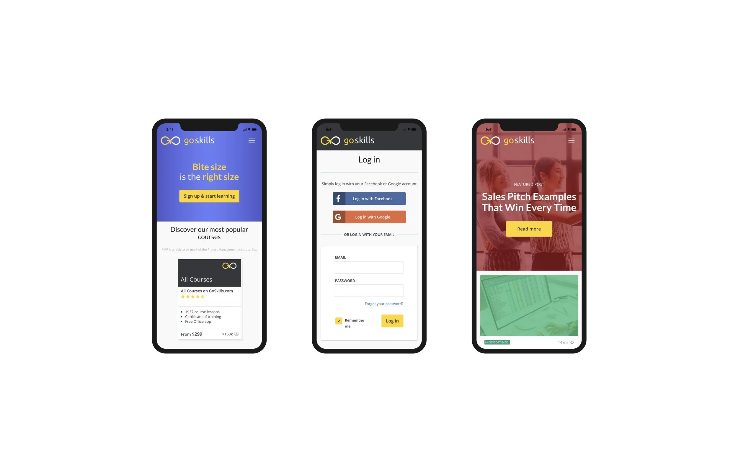
The logomark became our primary storytelling tool. We developed an ingenious design that simultaneously reads as "GO" and an infinity symbol—a visual metaphor for limitless learning and personal growth. This dual-interpretation speaks to the platform's core promise: learning is a continuous, never-ending journey.
While reimagining the brand, we recognised the strength of GoSkills' existing colour palette. The vibrant yellow, crisp white and deep charcoal were not just colours but a distinctive brand asset. In an industry often dominated by muted tones, these colours stood out—a visual representation of the brand's energetic approach to learning.