Case study—Georgiou Partnership
Disputes lawyers & advocates
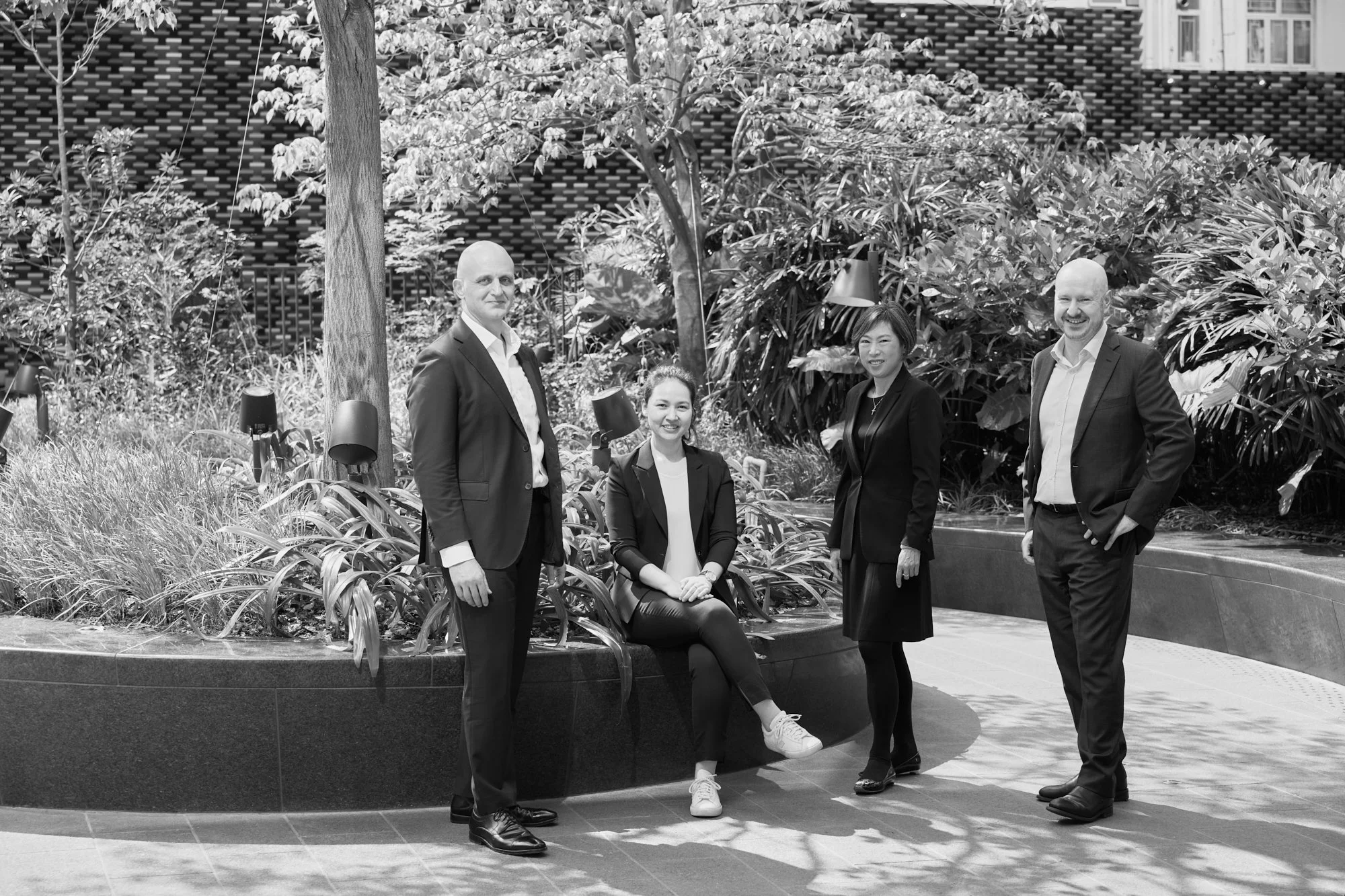
We first worked with Phillip, the founder of Georgiou Partnership, in 2020 on the brand identity of his previous firm. Because we had previously collaborated, we were uniquely positioned to help Phillip establish Georgiou Partnership, a firm specialising in disputes and compliance.
The brand's foundation rested on four critical pillars: partnership-driven leadership, passionate client defence, a fearless "David vs Goliath" approach, and an authoritative market presence. These were not mere words, but a strategic blueprint for a different legal practice.
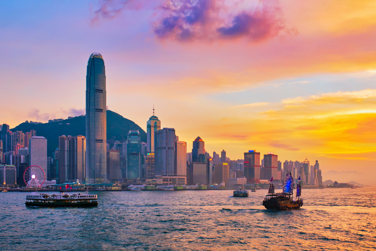


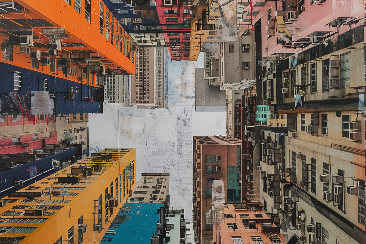
Our visual inspiration emerged from the architectural landscapes of Hong Kong—a city of complex geometries and cultural layers. The urban grid became a metaphor for the firm's approach: systematic, interconnected, and capable of navigating intricate challenges.


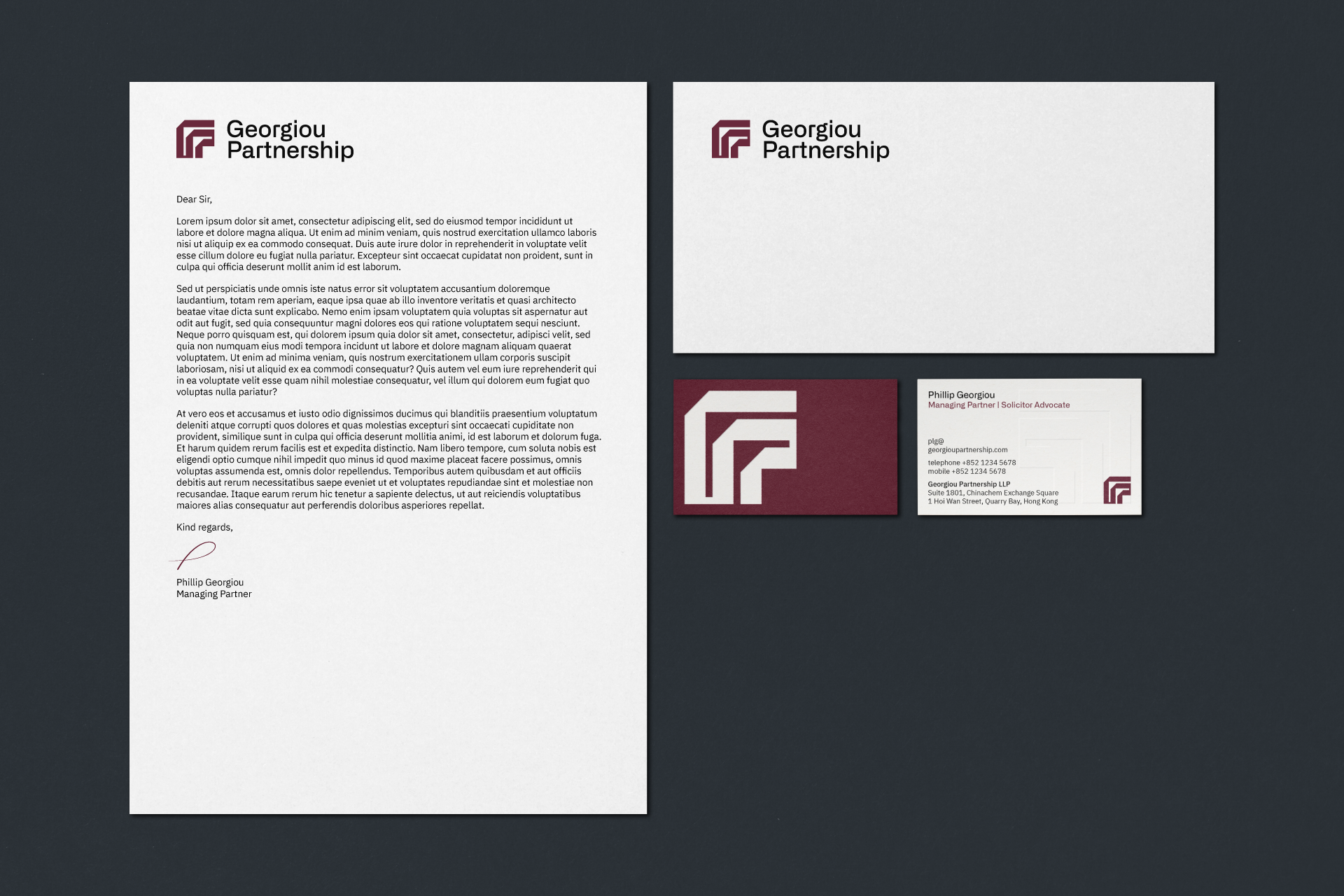
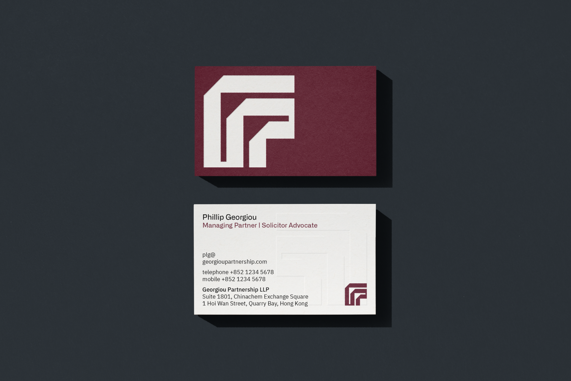
Constructed on a square grid, the logo uses a continuous path to spell the firm's name. Its geometric precision communicates the firm’s analytical rigour, while a hidden "aha" moment reflects its ability to provide innovative legal insights.
The process was a collaborative effort, with Phillip providing insights that guided our design choices. We weren't creating a brand in isolation but working alongside the firm's founder to bring his vision to life. Each design decision was a conversation, each iteration a step closer to capturing the firm's unique character.


Alliance No.2 Medium, selected for the logotype, mirrors the logo's geometric precision. Its medium weight balances strength and subtlety, reflecting the firm's approach to legal practice.
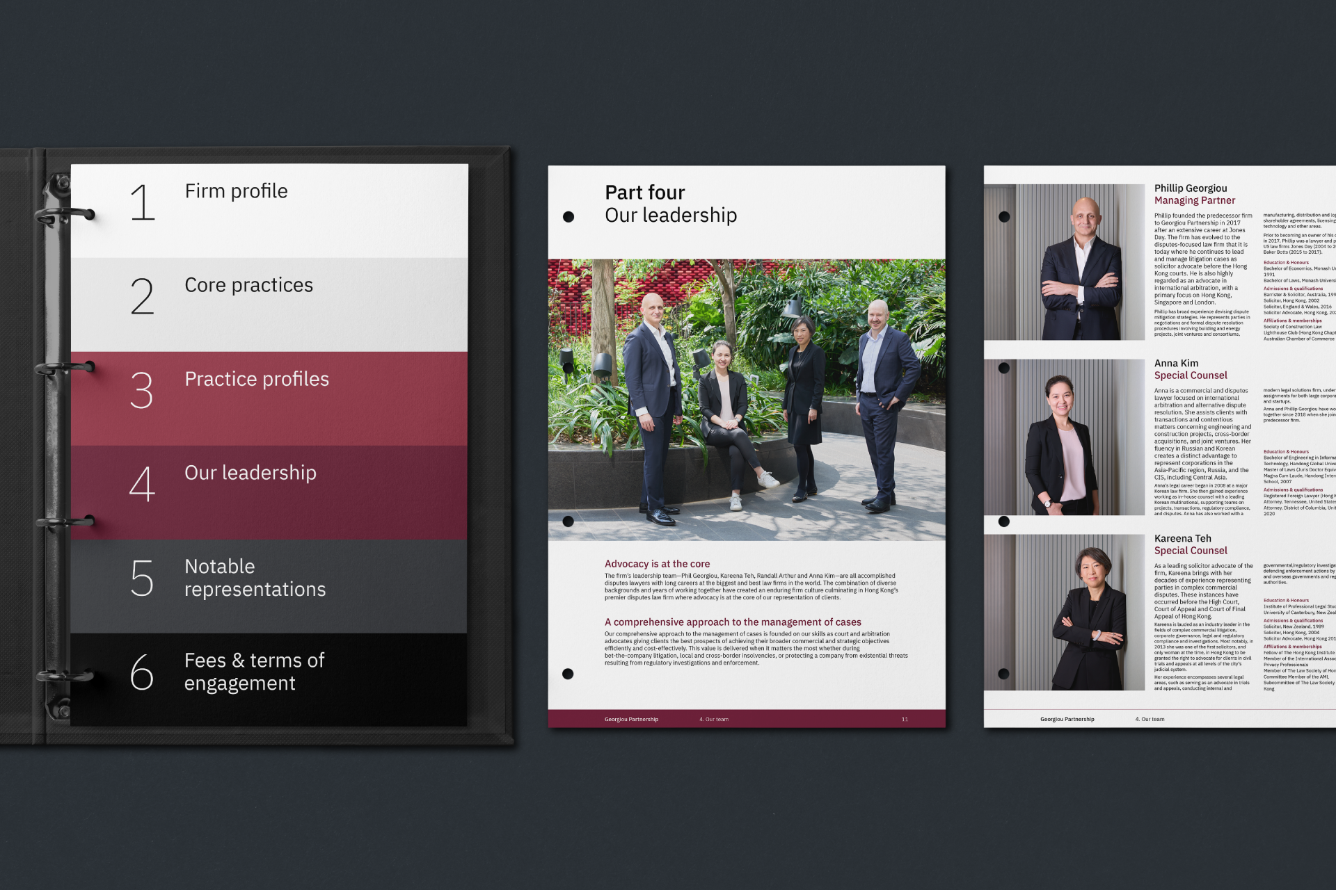
IBM Plex Sans complements the logotype as our content font. An open-source typeface, it embodies transparency and functionality. Its clean lines ensure readability across digital and print materials, speaking to the firm's commitment to clear communication.
Together, these typefaces create a typographic system that is professional and precise.


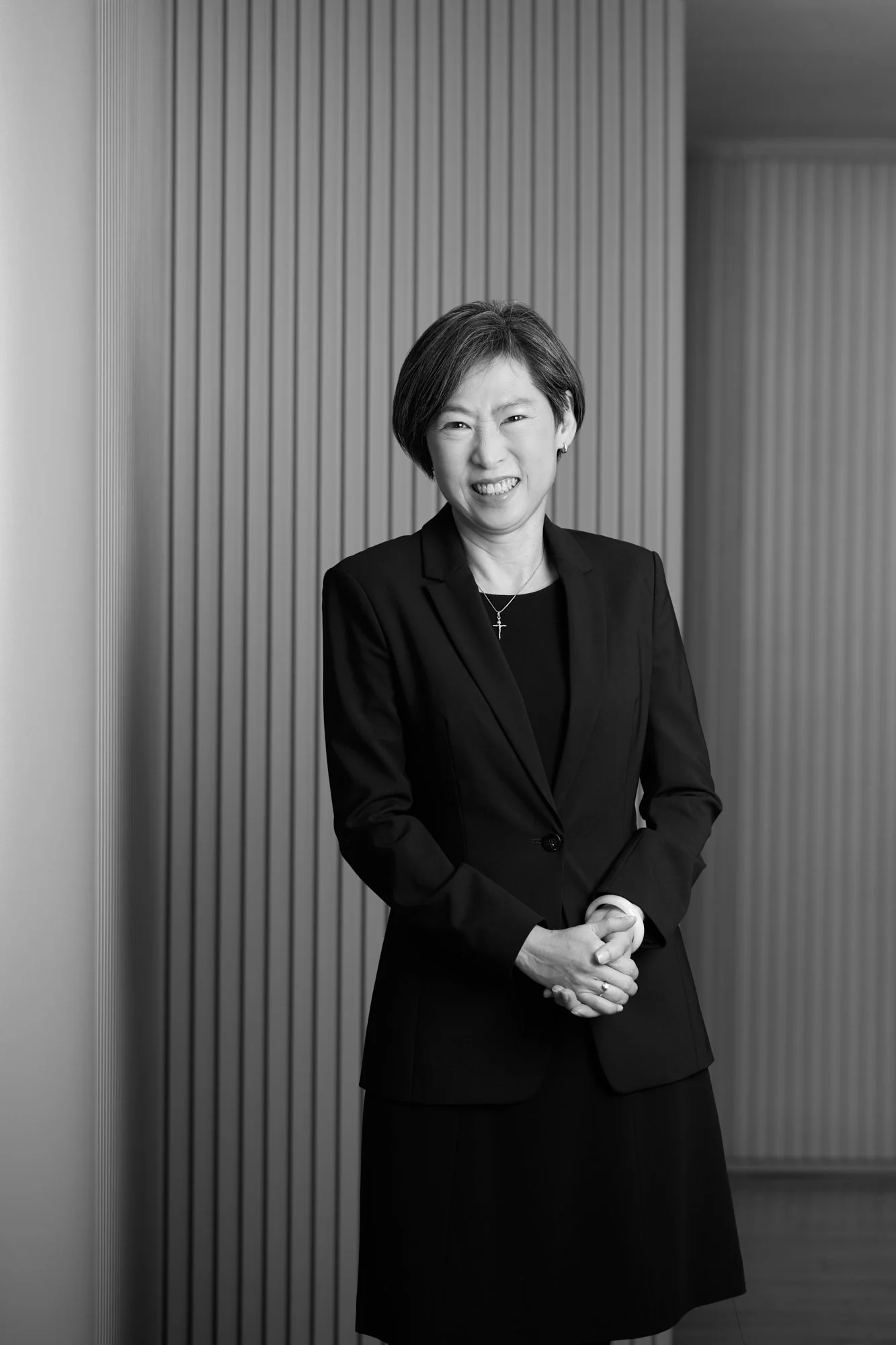
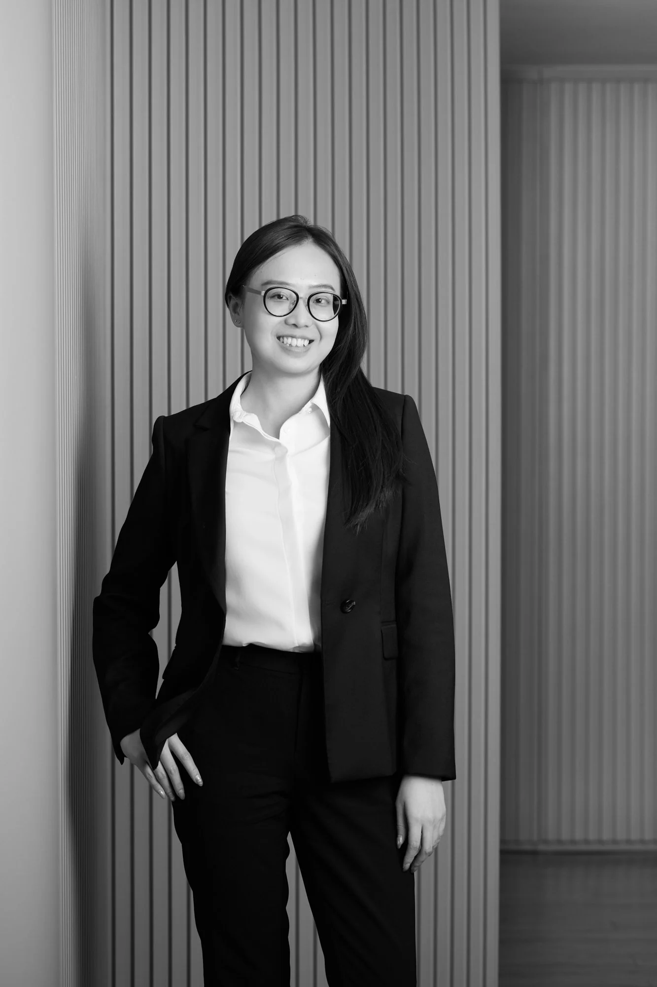
Corporate photography by Harold de Puymorin