Case study—Fair Trade Hong Kong

Fair Trade Hong Kong: Reimagining Ethical Commerce

Our branding journey with Fair Trade Hong Kong began with a deep exploration of the organization's fundamental purpose. Through an intensive brand strategy workshop with the board of directors, we peeled back the layers of their mission to uncover the core values that truly define their work.

Aerial view of green terraced rice fields with scattered huts and palm trees.
Two farmers wearing conical hats working in a lush green rice field with a small hut and trees in the background.

Four profound values emerged as the cornerstone of Fair Trade's identity: promoting equality, fostering positive commerce, championing traditional values, and building community networks. These were not mere words, but a comprehensive philosophy of ethical economic engagement.

Fair Trade Hong Kong's brand mission statement in black on white background.
Green equal sign on a white background
Blue plus sign on a white background.

— Champion traditional values

— Build community networks

— Foster positive commerce

— Promote equality

Pattern of alternating green and blue squares on a white background.
Abstract hashtag symbol with blue and green rectangular blocks on white background

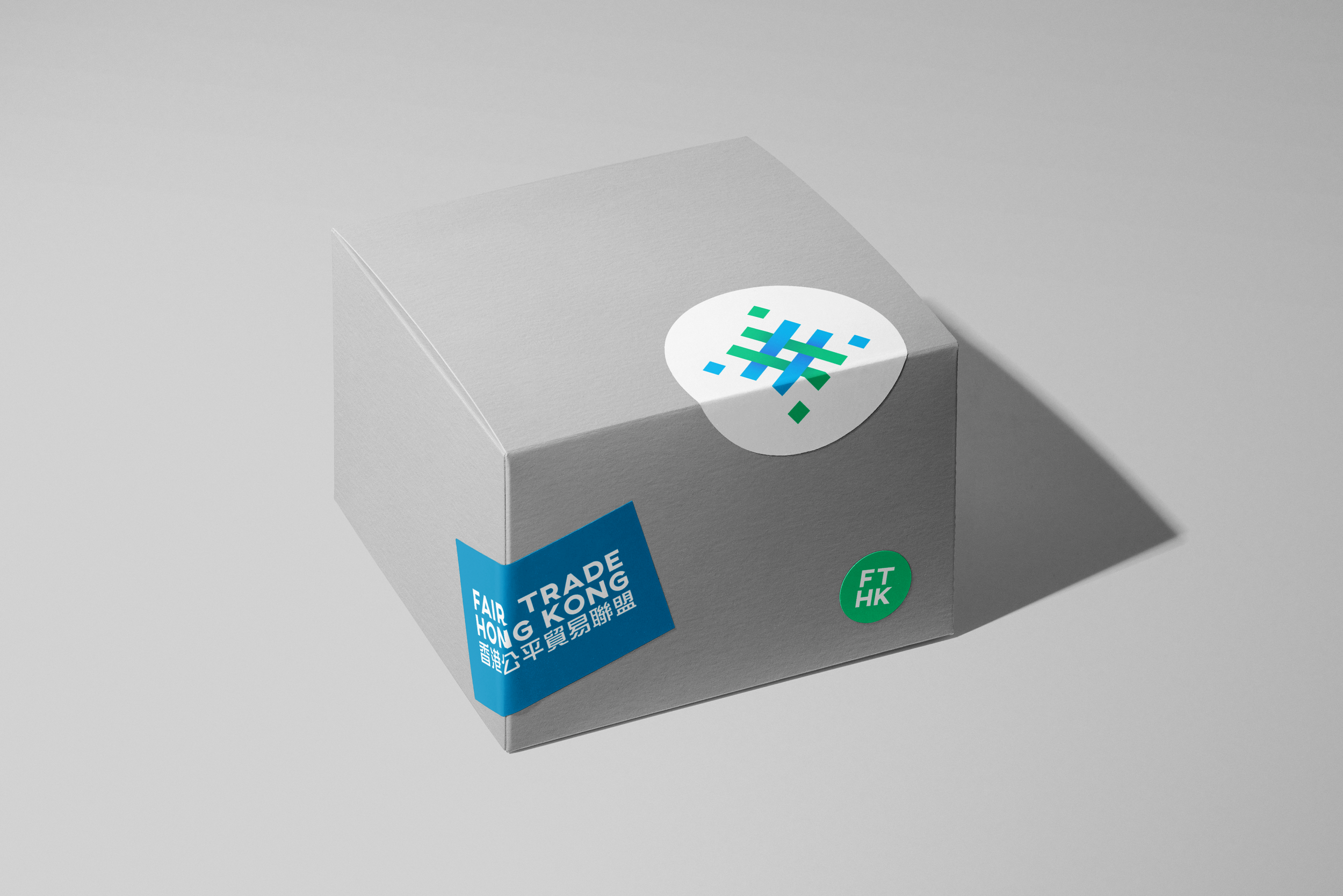
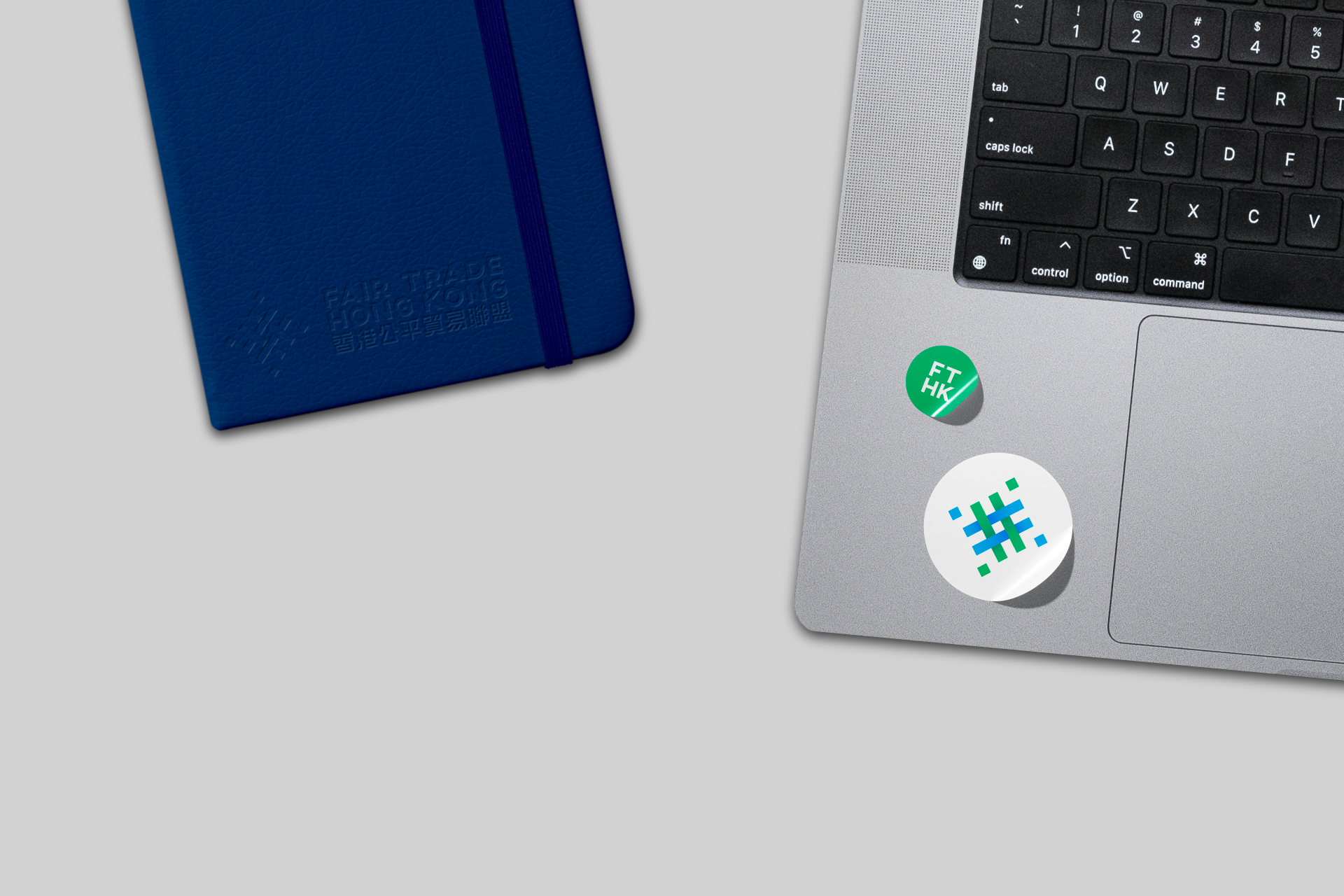
The resulting logomark became a visual metaphor for these interconnected values. Carefully balanced and geometrically precise, the design speaks to the organization's commitment to harmony and intentional social impact. Each element of the logo represents a delicate interconnection—much like the global networks Fair Trade seeks to support.

Logo of Fair Trade Hong Kong with text in English and Chinese alongside a geometric design.
Geometric pattern with intersecting diagonal lines creating a lattice effect on a light gray background.
Abstract geometric pattern with intersecting blue and green lines on a light gray background.
Abstract blue and green interlocking diagonal stripes pattern on white background.
Abstract geometric design with blue and green diagonal lines and blue diamond shapes on a white background.

Typographically, we selected Montserrat, an open-source typeface that embodies both authority and accessibility. Its clean, modern lines reflect the organization's forward-thinking approach while maintaining a sense of approachability. The choice of an open-source font itself becomes a statement, mirroring Fair Trade's commitment to transparency and shared resources.

Font specimen of Montserrat showing upper and lowercase text with numbers and punctuation in black on a white background.
Font specimen of Bold and Regular weights showing upper and lowercase text with numbers and punctuation in black on a white background.
Gray cardboard box with Fair Trade Hong Kong stickers and logo.
Fair Trade Hong Kong booklet on a green background.
Blue tote bag with geometric design and "Fair Trade Hong Kong" text in English and Chinese.
Stack of business cards for Fair Trade Hong Kong, featuring contact information for a project officer and a logo design in blue and green.
Man speaking with microphone labeled 'Fair Trade Hong Kong' in front of event banner.
Group of men in blue sports jerseys celebrating on a stage with a soccer ball, part of a team event.
A blue notebook with "Fair Trade Hong Kong" embossed and a laptop keyboard with two stickers visible on the corner.

Next project