Case study—ASTP
Reimagining knowledge transfer through strategic branding
In the complex knowledge exchange landscape, ASTP is a pivotal organisation connecting universities and industry partners across more than 40 countries. Established in 2000, it has grown to support over 800 members and become a critical network for knowledge transfer professionals. However, following a corporate merger, ASTP found itself at a crucial inflexion point—it needed a brand identity that could genuinely reflect its evolving mission and reconnect with its stakeholders.
Following a corporate merger, we were approached with a need to refocus the new organisation while bringing back the feeling of ownership to the stakeholders. The existing logo felt static, visually incohesive and had no ownable brand asset.
Scope of work
Brand strategy
Logo & identity system
Communications
Our branding journey began with an intensive discovery phase that went far beyond surface-level design considerations. We explored ASTP’s organisational DNA comprehensively, conducting in-depth interviews and strategy sessions to uncover the organisation's true essence.
The discovery process revealed a complex narrative of knowledge transfer. ASTP was more than a professional network—it was a bridge between academic innovation and industrial application, a facilitator of intellectual exchange that transcends traditional boundaries.
Through our brand strategy workshop, two fundamental brand pillars emerged:
Fostering Community Networks: ASTP’s ability to create meaningful connections between professionals and institutions.
Inspiring Knowledge Transfer: The organisation's commitment to facilitating meaningful intellectual and practical exchanges.
These pillars became the philosophical foundation of the new brand identity, guiding every subsequent design decision.

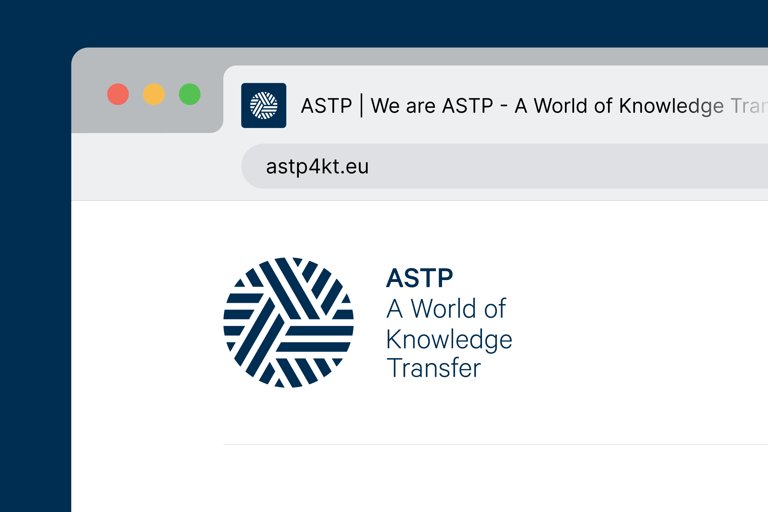
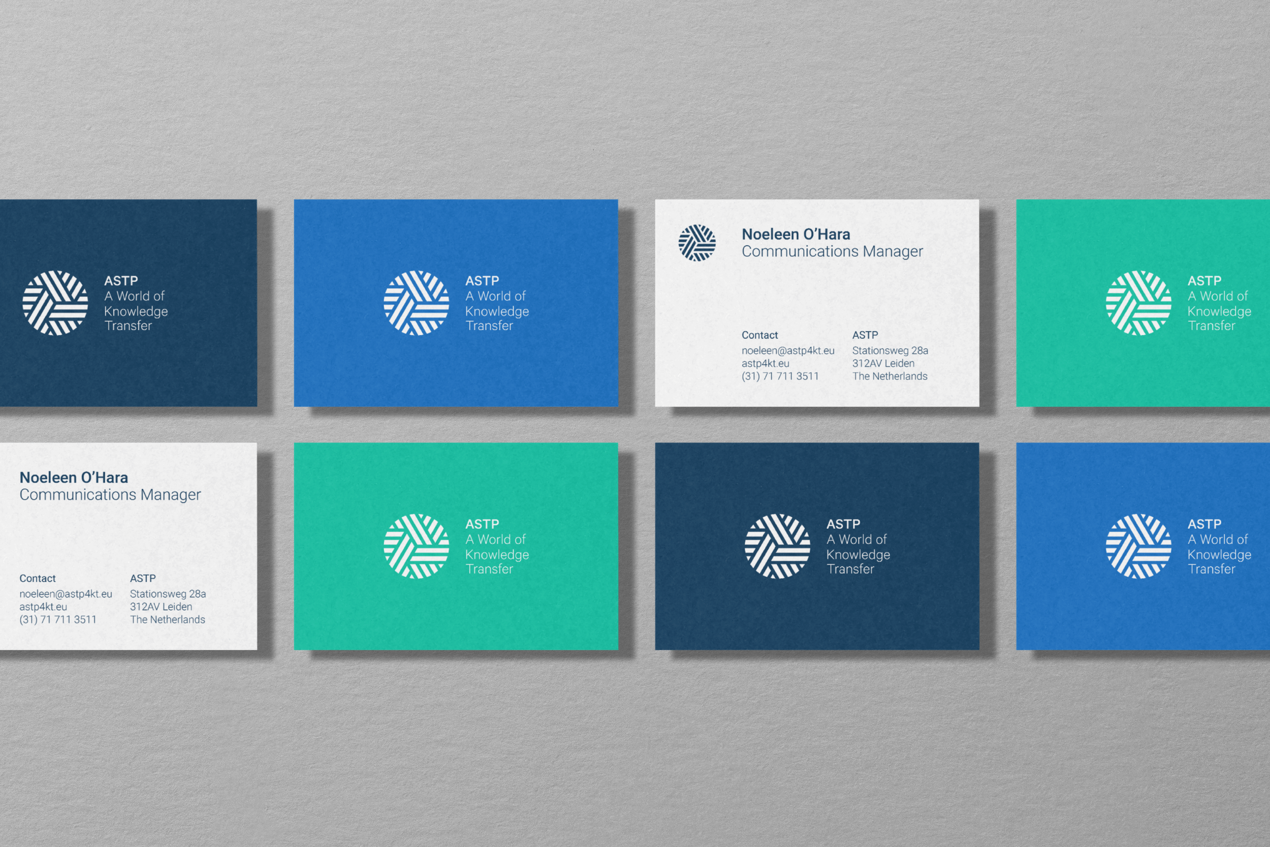
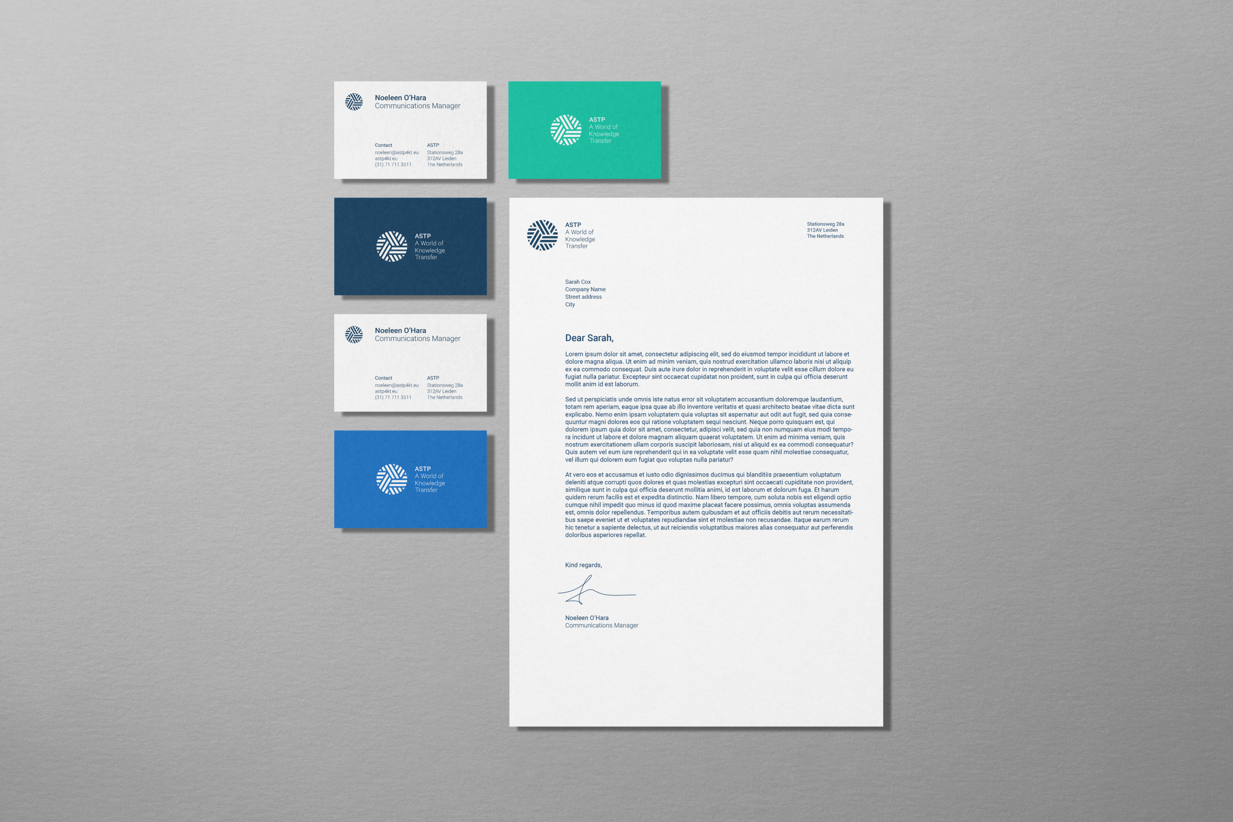
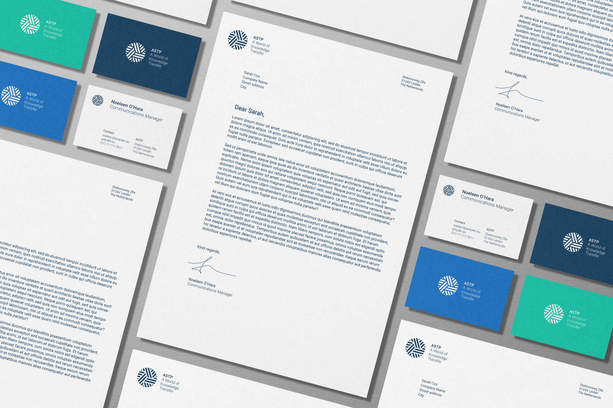
The logo design became a sophisticated visual metaphor for ASTP’s core mission. Three intersecting metaphoric highways represent the complex, multidirectional nature of knowledge transfer. This wasn't just a geometric exercise but a deliberate storytelling approach that visualised the organisation’s fundamental purpose.
The design carefully balances the organisation’s name and mission, creating a visual hierarchy that draws attention to ASTP’s core value proposition. Each line, each intersection becomes a narrative about connection, exchange, and collaborative progress.
The previous logo had felt static and visually disconnected—a visual representation of the organisation’s need for revitalisation. Our new approach sought to create an ownable brand asset that could communicate ASTP’s dynamic nature and global reach.
The brand aims to convey the organisation’s purpose:
— Interconnectedness
— Intellectual mobility
— Professional collaboration
— Global knowledge exchange