Case study—Foxpoint Search
Foxpoint Search: Crafting a brand identity for specialised recruitment
When an established recruitment agency approached us about expanding into the Australian market, we saw more than a simple geographic expansion. This was a pivotal moment of strategic transformation—an opportunity to reimagine the brand for a specific and dynamic market segment.
The leadership team’s vision was clear: to specialise in technology and fintech recruitment. This wasn't just a new service offering but a fundamental repositioning requiring a distinctive brand identity capable of standing apart from the existing agency.
Through our brand strategy workshop with leadership, we uncovered the firm’s core values:


— A personal approach to recruitment
— Technology-focussed, senior roles
— The teams curious nature in their clients
— Roles across data, cloud, transformation


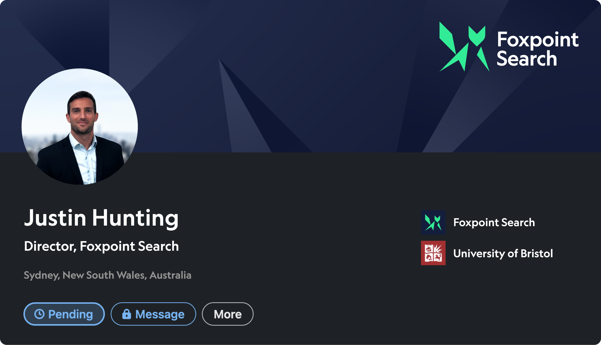
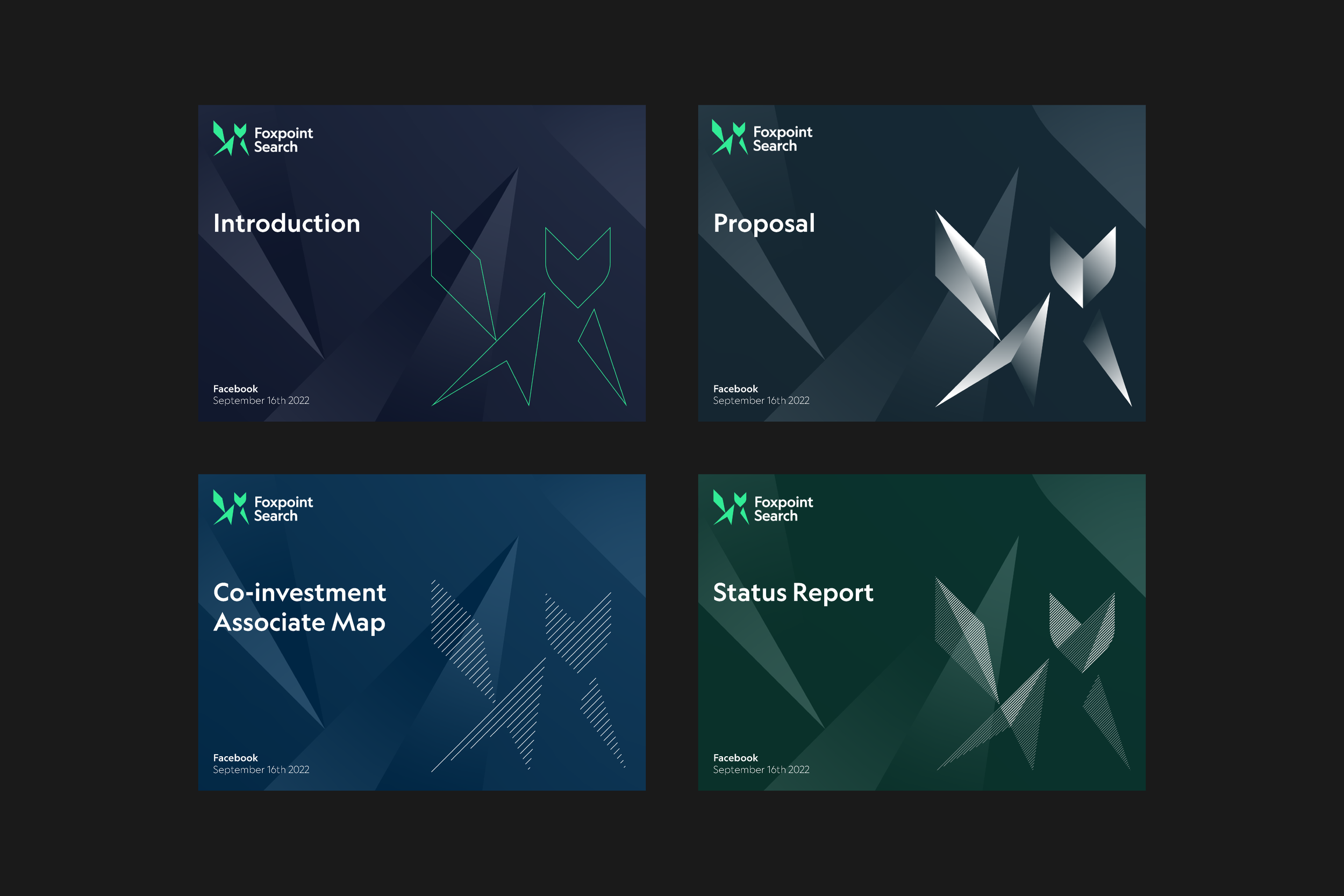
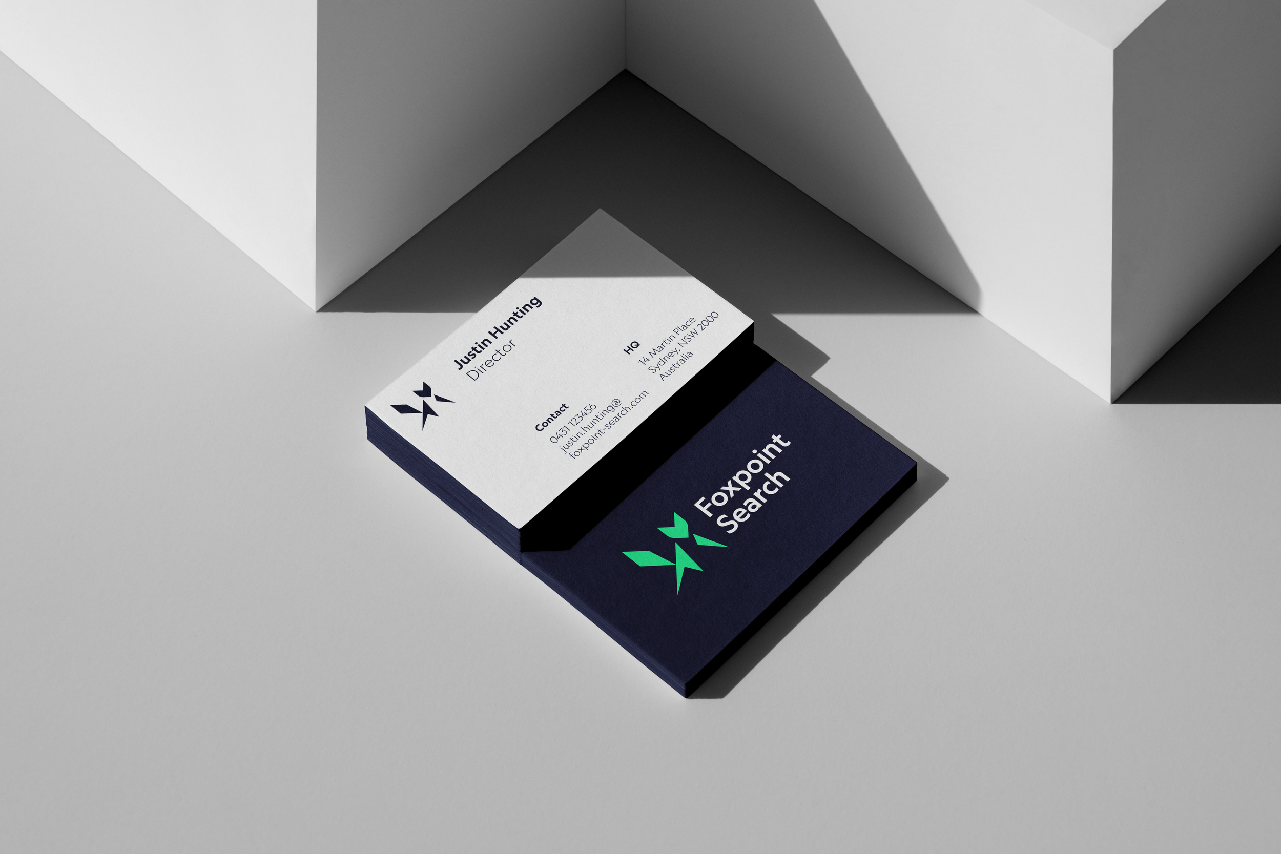
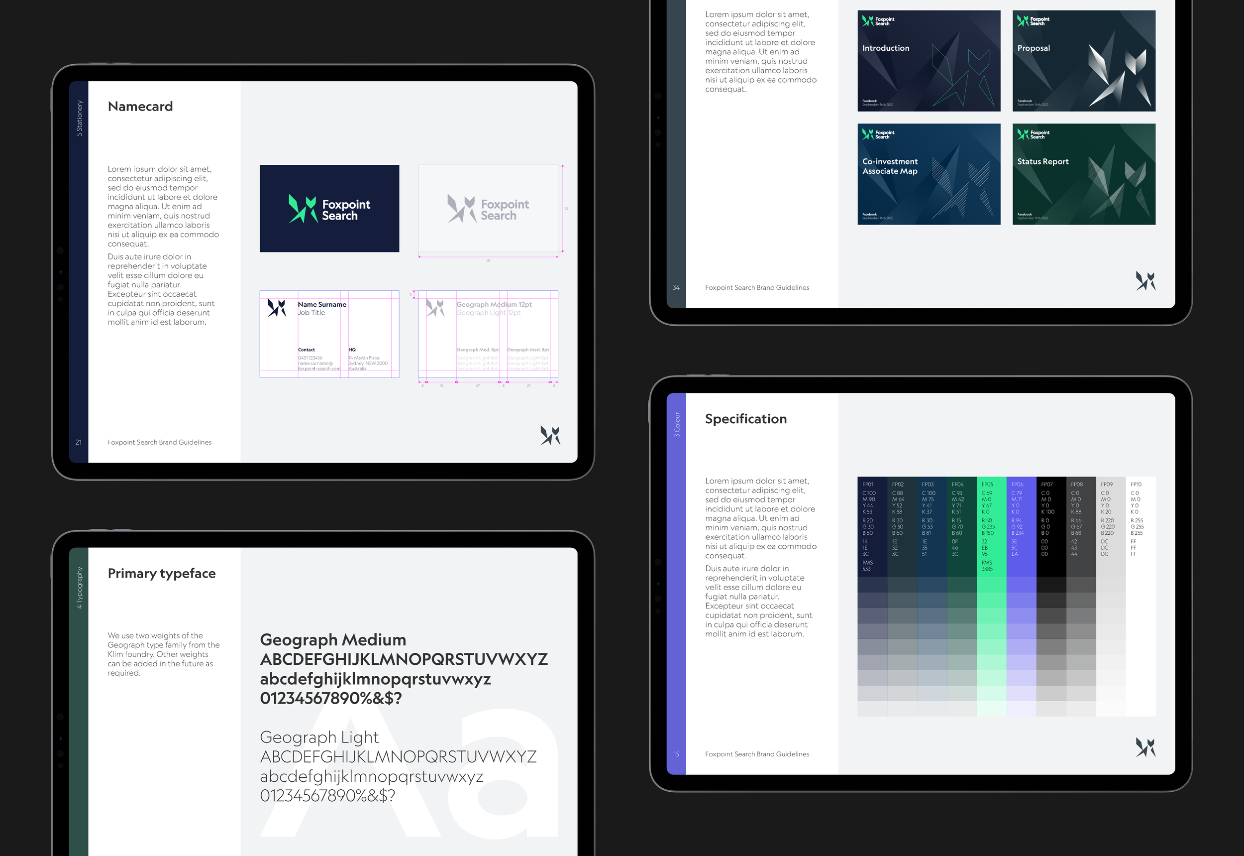
The brand’s visual language emerged from deliberately exploring the company’s core characteristics. The geometric fox icon became a powerful metaphorical representation of the brand’s essence.
Meticulously constructed on a precise grid. Its angular shape, formed from interconnected geometric elements, tells a story of precision and forward momentum. An integrated arrow shape guides the viewer’s eye upward and forward, a subtle visual metaphor for career progression and professional advancement.
The bright green colour communicates energy, innovation, and growth—qualities intrinsic to the technology and fintech sectors. The colour speaks directly to the target audience, signalling a modern, dynamic approach to recruitment.


— Master lockup
— Brand symbol

— Recognisable at small size
Geograph, the chosen typeface, complements the logo's geometric precision. Its clean, contemporary lines reinforce the brand's focus on technology and innovation. The typeface extends the visual identity, creating a cohesive and sophisticated brand language.