In this comprehensive guide, we’ll explore the essential elements of logo design and walk through creating a logo that truly represents your brand. Initially, companies branded products and services to differentiate them from their competitors. Today, logos must do more than ever: they must capture attention and communicate the brand’s personality and core values, all while functioning well in print, digital, and vast ranges of size and placement down to a website favicon.
Logos are vessels of meaning that capture brand equity over time.
Branding design combines creativity with a critical process. During our client engagements, we follow the process of visual reference, logo concepts, iterative presentation and review sessions. Before we look at our process, let’s look at the four kinds of logos, what your logo must do for you, and the common mistakes to avoid when creating logos.
The four kinds of logos
The world of logo design encompasses several distinct categories, each serving different brand needs and objectives. Understanding these categories helps inform which approach might work best for your brand:
Wordmarks (Logotypes)
These rely entirely on typography to represent your brand. Consider how Selfridges transformed its identity with a clean, sophisticated wordmark that works beautifully across digital and physical applications. The typography alone conveys luxury, heritage, and modernity without additional symbols.
Symbol-only (Logomarks)
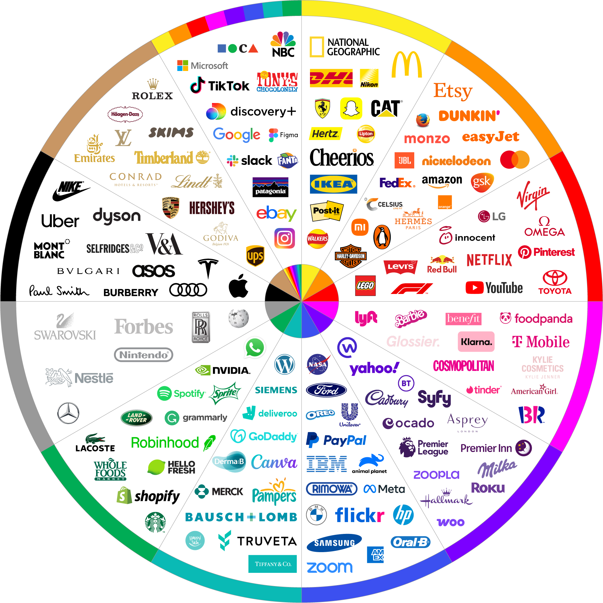
These use distinctive visual elements without the need for text. This is a common attribute used by the world’s largest companies. Think Apple, Mastercard, F1.
Once a brand gets to a high level of recognisability, it may choose to use their name (logotype) and symbol (logomark) separately. Think Tesla, Apple, VW. Often these brands have artistic logotypes for the wordmark. These brands are so well recognised that most people can recognise the brand without the word.
Mastercard’s iconic logo, constructed by overlapping circles, demonstrates how bold geometric shapes can become recognisable while remaining versatile across applications.
In 1968, Mastercard (then Interbank) introduced the overlapping circles, but with much more complexity - the circles contained intricate patterns and the name "“Master Charge" appeared in a heavy serif font. These circles represented the merging of two banks, with the overlapping section symbolising their collaboration.
Through the 1970s and 1980s, the design was progressively simplified. The intricate patterns were removed, the typography was modernised, and the colours were refined. Each iteration maintained the core concept while removing unnecessary elements.
The 2016 redesign by Pentagram marked a crucial step. They simplified the colours, removed the combed effect in the middle section, and positioned the name below the circles rather than across them. This created a cleaner, more digital-friendly design while preserving instant recognition.
The colours themselves are carefully chosen for both practical and psychological reasons. The red circle represents passion and excitement, while the yellow/orange suggests warmth and optimism. The orange overlap creates a sense of transparency and trust - crucial values for a financial services brand. These colours also provide excellent visibility across different backgrounds and contexts.
What makes this logo particularly masterful is its versatility. The simple geometric shapes:
Scale perfectly from tiny card chips to massive billboards
Remain recognisable in black and white
Work equally well in digital and physical spaces
Cross cultural and language barriers effortlessly
Function effectively in motion for digital applications
Removing the wordmark in 2019 wasn’t just a design decision - it was a strategic response to our digital age. In mobile apps and small digital spaces, the symbol alone provides instant brand recognition without requiring text. This adaptability to digital contexts while maintaining traditional recognition demonstrates how thoughtful logo design can bridge past and future needs.
The Mastercard logo also teaches us about the power of consistency. While the design has been refined over decades, the core concept of overlapping circles has remained unchanged. This long-term consistency has built such strong brand recognition that the name became secondary.
Emblem logos (Badges)
Emblem marks combine letters or words into pin badge-style logos. These often have a sense of heritage and are common within automotive industries.
Combination Marks
Merging text and symbols allows for flexibility when creating brand touchpoints. The logomark can be used alone, or as backgrounds or within brand patterns.
Waitrose & Partners recently updated their identity to include both their signature wordmark and a distinctive symbol, allowing flexible usage across different contexts while maintaining brand recognition.
Combination logos are the most common kind we develop for clients. This is because they offer the client the highest chance of differentiation, the ability to foster brand recognition, and the most flexibility when creating brand touchpoints.
Key principles of logo design
Successful logo design adheres to several fundamental principles that ensure longevity and effectiveness:
Simplicity stands as the cornerstone of memorable logo design. Consider how British Airways simplified its speed bird symbol over decades, retaining its core essence while becoming progressively more refined and functional. This simplification process didn't diminish the logo's impact but enhanced its versatility and recognition.
Memorability emerges from distinctive elements that capture attention. The London Underground's roundel achieves this through its unique combination of circle and bar, creating an instantly recognisable symbol that's remained effective for over a century. This demonstrates how geometric simplicity when thoughtfully executed, can create enduring brand recognition.
Versatility ensures your logo functions effectively across all applications. Study how the BBC blocks system works seamlessly, from tiny mobile apps to massive building signage. Their logo succeeds because it maintains clarity and impact regardless of size or context.
Relevance connects your logo to your brand’s essence. Notice how Brompton Bicycle's logo subtly incorporates cycling elements into its design without being overly literal, creating a sophisticated mark that resonates with its urban cycling audience.
Colour psychology in logo design
Colour choices profoundly impact how your brand is perceived. Understanding colour psychology helps create emotional connections with your audience.
Colour selection requires understanding different hues’ psychological impact and practical applications. Consider how the distinctive purple of Cadbury has become so closely associated with their brand that it's now a registered trademark.
Deep Blues, as used by Barclays and the NHS, convey trust, stability, and professionalism. These institutions leverage Blue’s psychological associations to reinforce their trustworthy nature.
Vibrant Greens, seen in Lloyds Banking Group’s identity, suggest growth, sustainability, and renewal. Their particular shade bridges traditional banking stability with contemporary environmental consciousness.
Warm Reds, employed by Virgin’s brands, communicate energy, passion, and dynamism. Their consistent use of red across diverse business sectors has created strong brand recognition while maintaining these emotional associations.
Creating an effective colour palette involves:
Primary colours — Choose a main colour that captures your brand’s essence. The rich green of Harrods represents luxury and heritage while still feeling contemporary.
Secondary colours — Develop supporting colours that complement your primary choice. Please look at how the Natural History Museum uses an earth-tone palette that reflects their connection to nature while remaining sophisticated.
Colour variations — Plan for different colour scenarios. The National Theatre's logo works equally well in solid black, reversed white, or their signature bright red.
For more information about colour theory, please see our blog post, Understanding and Applying Colour Psychology in Branding.
Typography selection
Typography in logo design goes beyond simply choosing an attractive font. Your typographic choices should reflect your brand's personality while ensuring legibility across all applications. Consider how the Royal Opera House uses a refined serif typeface that echoes its cultural heritage while remaining crisp and readable at any size. In contrast, the modern sans-serif typography of Dyson communicates its position as an innovation-led company.
When selecting typography, consider these crucial factors:
Your typeface should maintain legibility at both large and small sizes. The British Heart Foundation's logo perfectly demonstrates this principle, with clean letterforms that remain clear on a tiny pin badge or a large billboard.
The character spacing and weight should balance aesthetically. Notice how Marks & Spencer's typography creates an elegant, sophisticated appearance through carefully considered letter spacing and consistent stroke weights.
Custom modifications to existing typefaces can create distinctiveness while maintaining professionalism. The BBC’s modified Reith Sans typeface exemplifies how subtle customisation can create a unique brand asset.
Shape and form considerations
The basic shapes used in your logo carry subtle psychological meanings that influence how your brand is perceived. Circular forms, like the London Underground roundel, suggest unity and continuity. As seen in the V&A logo, Angular shapes can convey strength and dynamism.
When working with shapes, consider:
Basic geometric forms — Simple shapes often create the most memorable logos. The Channel 4 logo demonstrates how basic geometric forms can create a distinctive and enduring identity.
Negative space — Clever use of negative space can add layers of meaning. The FedEx arrow (between the E and x) shows how subtle details can enhance logo design.
Balance and proportion — The relationship between different elements should feel harmonious. Study how the Penguin Books logo balances the penguin symbol with the wordmark.
Technical considerations
Understanding the technical aspects of logo design ensures your logo functions effectively across all applications.
Vector formats — (AI, EPS, SVG) are essential for scalability and professional printing. These formats allow your logo to be reproduced at any size without loss of quality.
Raster formats (PNG and JPEG) are necessary for digital applications, each with specific uses. PNG is best for web use when transparency is needed, and, JPEG is suitable for situations where file size needs to be minimised
Working files — Maintain organised working files with labelled layers and colour information for future modifications.
CMYK — (Cyan, Magenta, Yellow, Key/Black) are used for printed materials, ensuring colours appear as intended in physical applications.
RGB — (Red, Green, Blue) are required for digital displays, websites, and screen-based applications.
Pantone matching system — (PMS) specifies exact colours for consistent reproduction.
Size & context
Responsive elements — Consider adjusting or removing elements at different sizes while maintaining brand recognition. The Guardian's logo demonstrates this with versions ranging from full masthead to a simple "G" icon for mobile applications.
Minimum size requirements — Establish and document the smallest size at which your logo can be reproduced while maintaining legibility.
Social media requirements — Use across digital platforms is a crucial consideration when creating your logo. To help legibility, logos must ensure good use of space when placed within a square frame. This is because social media platforms like LinkedIn, Facebook, Instagram and website favicons use 1:1 frame ratios. Within these platforms, these frames are often set at small sizes. Companies with long names should think strongly about using a logomark, not only a wordmark logo. Even shorter-named brands like Google and Amazon, those without logomarks use their initials as their logotype for 1:1 scenarios.
Common mistakes to avoid
Understanding potential pitfalls helps create more successful logo designs.
Over-complicating the design — Don’t fall into the trap of incorporating too many elements or ideas into a single logo. Remember how the British Rail logo’s simple arrows created an iconic design that lasted decades? Simplicity helps make sure your logo will stand the test of time. (Please see every branding clip ever from The Apprentice! Those poor designers…!)
Following trends — While it’s tempting to follow current design trends, this can lead to a logo that quickly feels dated. Consider how the Shell logo has evolved subtly while maintaining its core recognisable elements, avoiding trendy gimmicks that would have dated promptly.
Poor scalability — A common oversight is not testing logo designs at tiny sizes. The Premier League lion logo shows how careful attention to detail allows complex designs to work even at minimal sizes.
Lack of distinctiveness — Creating a logo that blends in with competitors defeats its purpose. When Tesco Bank entered the financial sector, it maintained its distinctive red colour rather than adopting traditional banking blues, helping it stand out in the market.
Logo design process
1. Moodboards
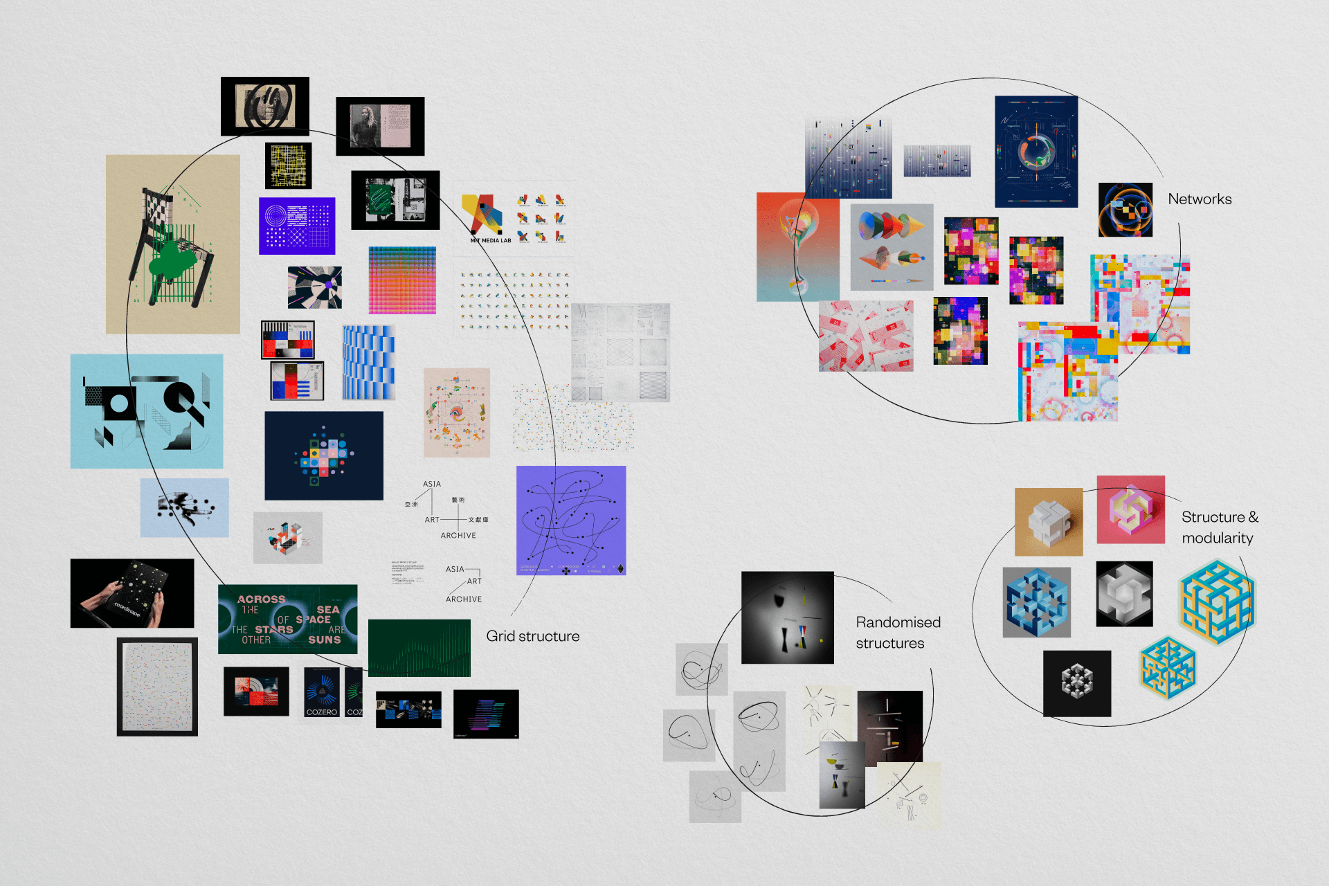
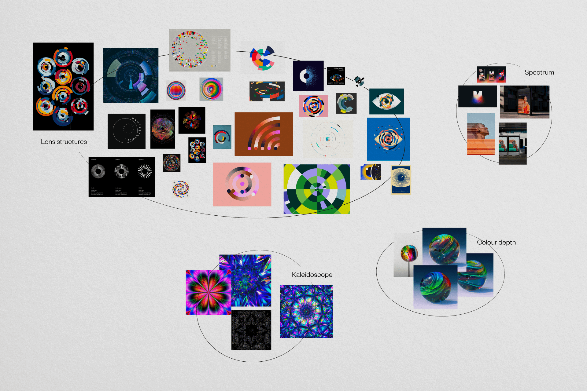
The initial phase is exploratory and broad. It is like a visual treasure hunt, where designers collect inspirational references that might seem disparate at first glance but ultimately connect to the brand’s strategic heart. These ‘visual metaphors’ are built from your brand strategy, core values, positioning, and mission.
A technology startup might draw inspiration from sleek architectural forms, minimalist design, and innovative scientific imagery. At the same time, a sustainable outdoor brand might explore natural textures, earthy colour palettes, and images of environmental conservation.
Moodboarding is a critical technique in the logo design process. Think of it as creating a visual collage that captures the brand’s spirit. Designers collect and arrange diverse visual elements—logos, artworks, photographs, design fragments—looking for unexpected connections and emerging visual themes. This isn’t a linear process but an intuitive exploration that allows creative thinking to flow freely. By annotating these collections, designers map out the visual language that will inspire the brand’s identity.
2. Sketching
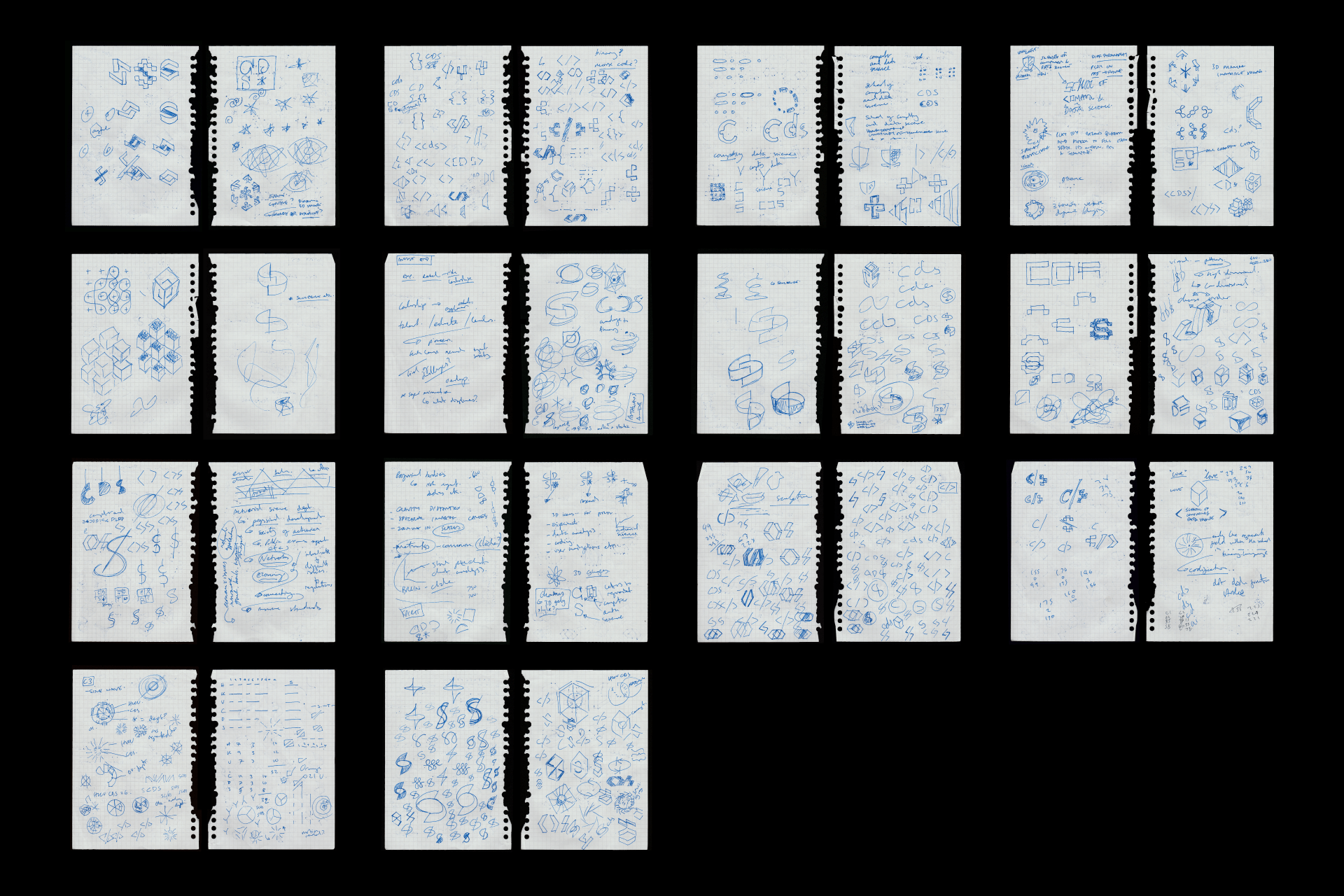
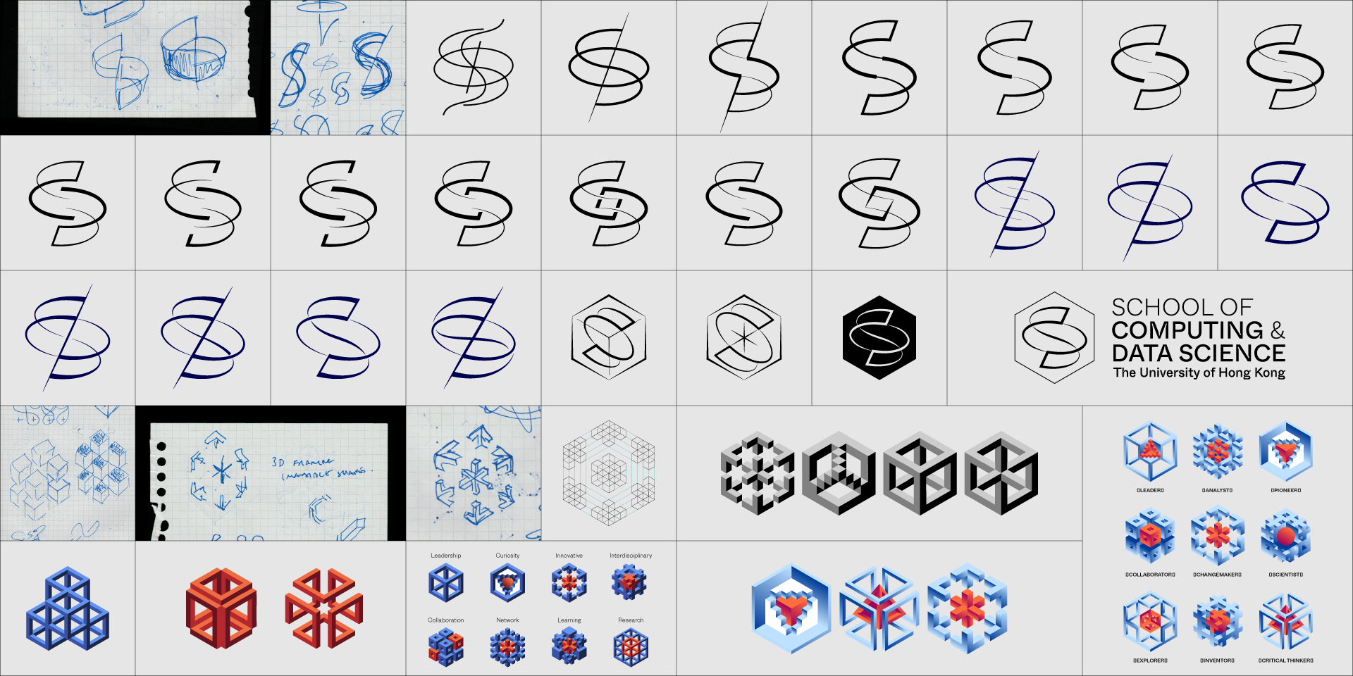
Your initial sketches are the first representations, the first time you turn words into images. You can enjoy this process no matter how good you are at drawing. (No excuses!) Keep it simple and choose a couple of core values to keep in mind.
Logo design is a rigorous visual problem-solving process. Designers begin with loose, freeform sketching—a stage that embraces spontaneity and welcomes unexpected creative accidents.
As your visual explorations develop, start to consider the sketches critically and narrow down your ideas. Ask yourself if each concept is distinctive and relevant to your business, and communicates your core values.
3. Digitising
When your ideas become more refined and precise on your page and in your mind, bring these sketches into digital vectors. You can scan your pages, import them into vector software like Adobe Illustrator or Figma, and steadily turn your loose sketches into crisp, clear forms. Focus on visual balance, think about whitespace, and balance meaning with beauty.
You can start identifying specific design elements that will compose the brand’s visual toolkit: distinctive icons that can communicate complex ideas quickly, graphic components that provide visual consistency, carefully selected colour palettes that evoke specific emotional responses, typography that speaks to the brand’s personality, and photographic styles that reinforce the brand's narrative.
4. Review and revision
The iterative process is intense and methodical. Designers might create hundreds of logo variations, critically evaluating each iteration against three fundamental criteria: strategic meaning (how well the logo communicates the brand's essence), aesthetic form (its visual beauty and uniqueness), and functional simplicity (how effectively it communicates across different contexts and media).
5. Finalised logo
The final logo is more than just a visual mark—it’s a strategic tool that encapsulates the brand’s identity. Your logo is your vessel for meaning and brand equity. It must work seamlessly across various applications, from tiny mobile app icons to large billboard displays, while maintaining its core visual integrity and communicative power.
This holistic approach transforms abstract brand strategy into a compelling visual identity. It’s a delicate balance of creativity, strategic thinking, and design expertise— turning intangible brand values into a visual language that can communicate, inspire, and connect with audiences.
Final notes on logo design
Creating an effective logo requires understanding fundamental principles, following a thorough process, and paying attention to creative and technical details. Whether you’re designing in-house or working with professionals, this guide provides the framework for developing a logo that is a strong foundation for your brand identity.
Remember that your logo is the beginning of your brand’s visual story. In our next article, we’ll explore how to build a complete visual identity system that extends your logo into a structured system that you can use on your brand touchpoints.
About the author —
Adam is the co-founder of Attend The Way, a Brighton-based branding agency. Adam helps build brands for companies at every growth stage, from startups to industry leaders. Adam has consulted and built brands for some of the world’s most recognised companies.


