Case study—Yun Ya
Crafting a cross-cultural brand identity
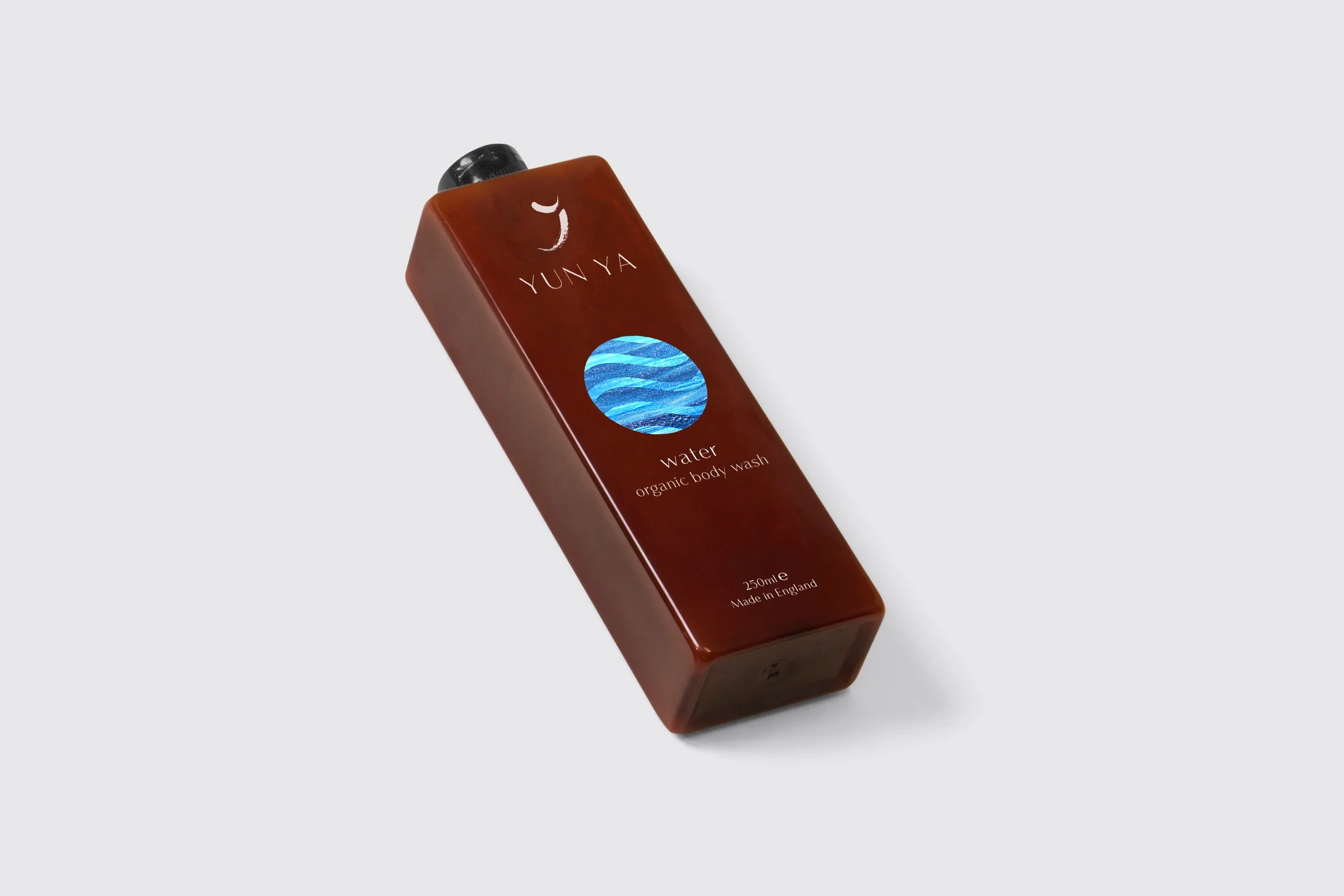
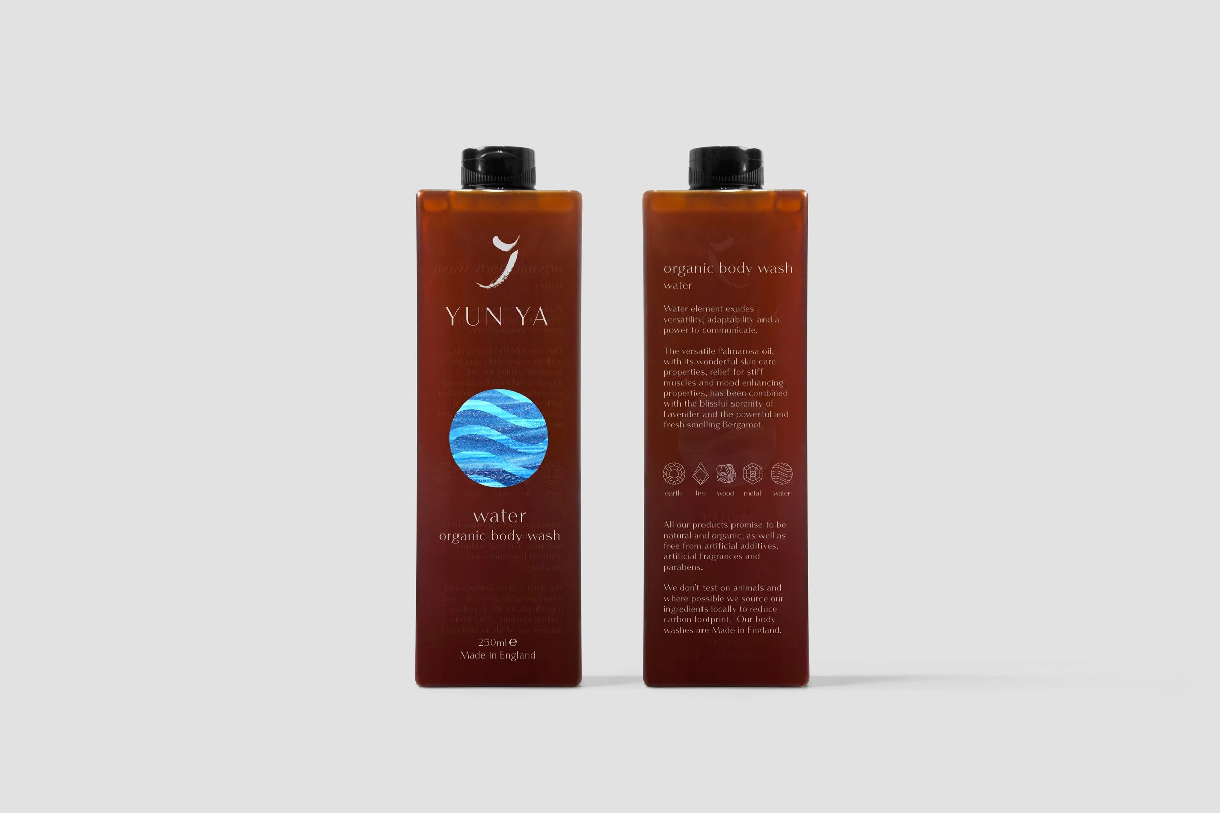
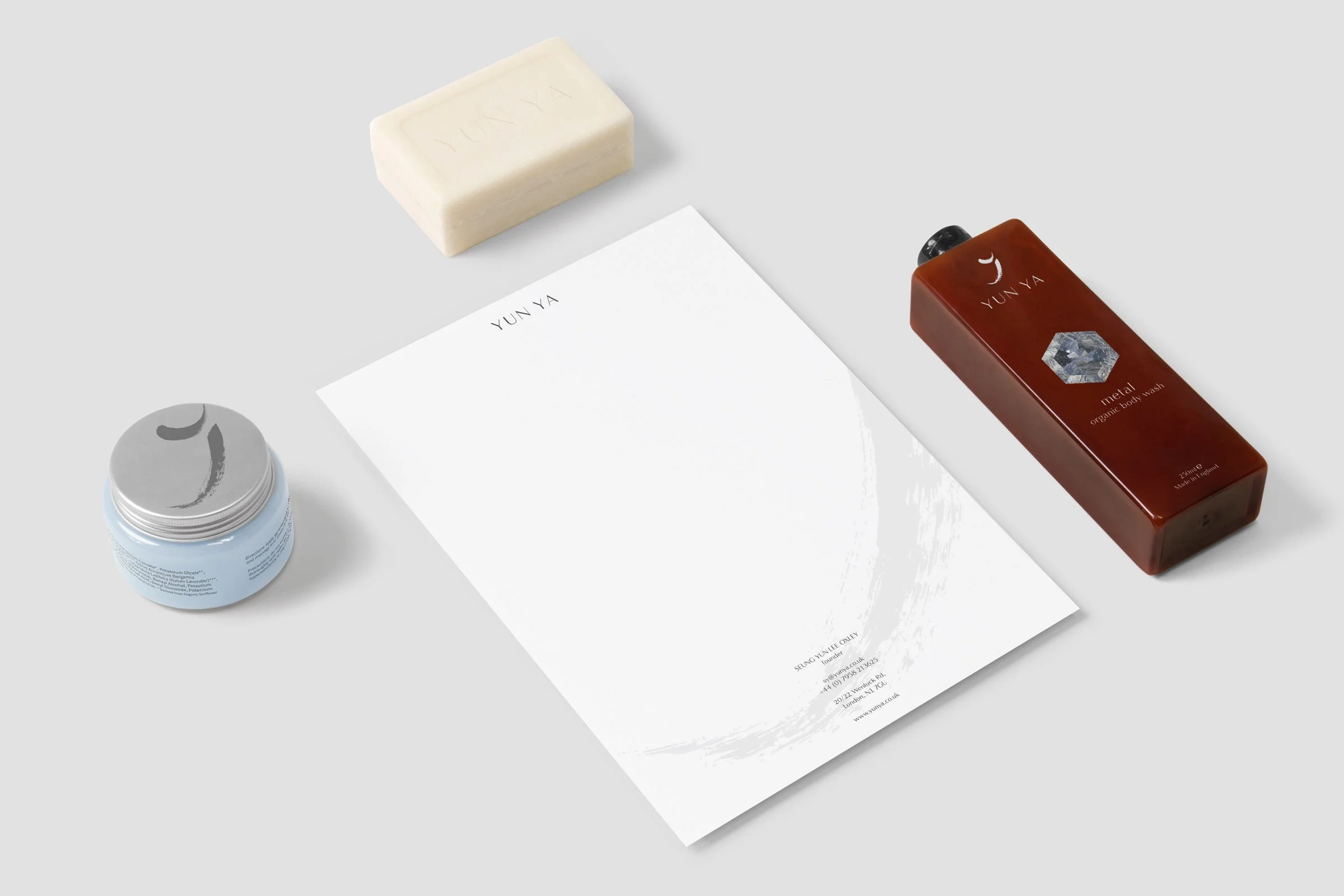
Yun Ya is a Chinese-inspired unisex body wash founded in Brighton. The client wanted an authentic logo at the brand's heart; thus, we designed an identity to capture its cross-cultural history and framing.
The challenge was creating a logo and developing an authentic visual identity that could tell a rich, cross-cultural story through design.
Scope of work
Logo & identity system
Communications
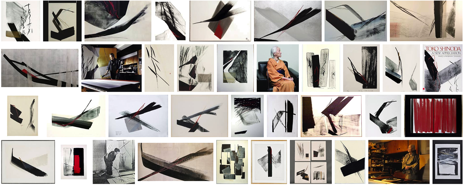
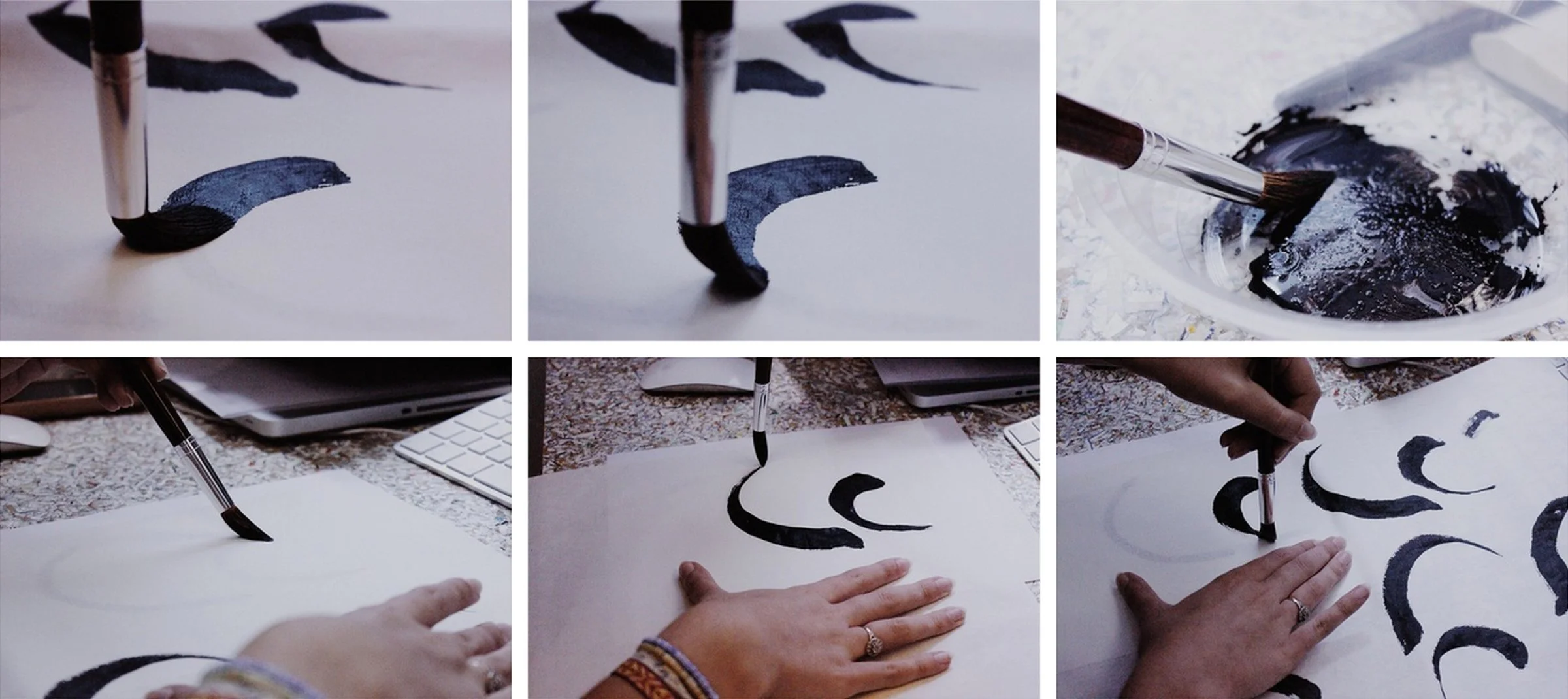
Our design approach drew inspiration from two profound artistic traditions that share a deep understanding of balance, movement, and negative space: Chinese calligraphy and the minimalist Sumi ink paintings of Japanese artist Toko Shinoda.
The logo became a carefully choreographed dance of two abstract brush strokes. This was not a random design choice but a deliberate artistic statement. In East Asian artistic traditions, brush strokes are far more than mere lines—they are living entities that capture motion, emotion, and philosophical balance.
The two interconnected strokes became a powerful metaphor for Yun Ya's brand essence. Balance is not about uniformity but about the dynamic interaction of different elements. Just as the brush strokes lean into each other without losing their character, the brand represents a nuanced dialogue between cultural identities.
The logo transcends traditional branding approaches. It's an invitation to explore the space between cultures—to see beauty in difference, to find connection in diversity. This was a bold and sophisticated approach for a unisex body wash positioning itself in the UK market.


View all projects